03
03
03
Problem Statement
Problem Statement
The payment process of Swiggy for ordering food takes 1-2 more steps than it requires and also has interface and information issues. I have further elaborated the problems in define phase.
The payment process of Swiggy for ordering food takes 1-2 more steps than it requires and also has interface and information issues. I have further elaborated the problems in define phase.
Solution
Solution
To redesign the whole payment process which includes making the interface better, creating smooth payment process with lowest number of steps required and enhancing the user experience by implementing a user-centered design approach.
To redesign the whole payment process which includes making the interface better, creating smooth payment process with lowest number of steps required and enhancing the user experience by implementing a user-centered design approach.
(Project Duration: 2 weeks)
(Project Duration: 2 weeks)
Swiggy Redesign
Swiggy Redesign
UX Problem Solving
UX Problem Solving
DESIGN PROCESS
empathize
Define
ideate
design
prototype
RESEARCH
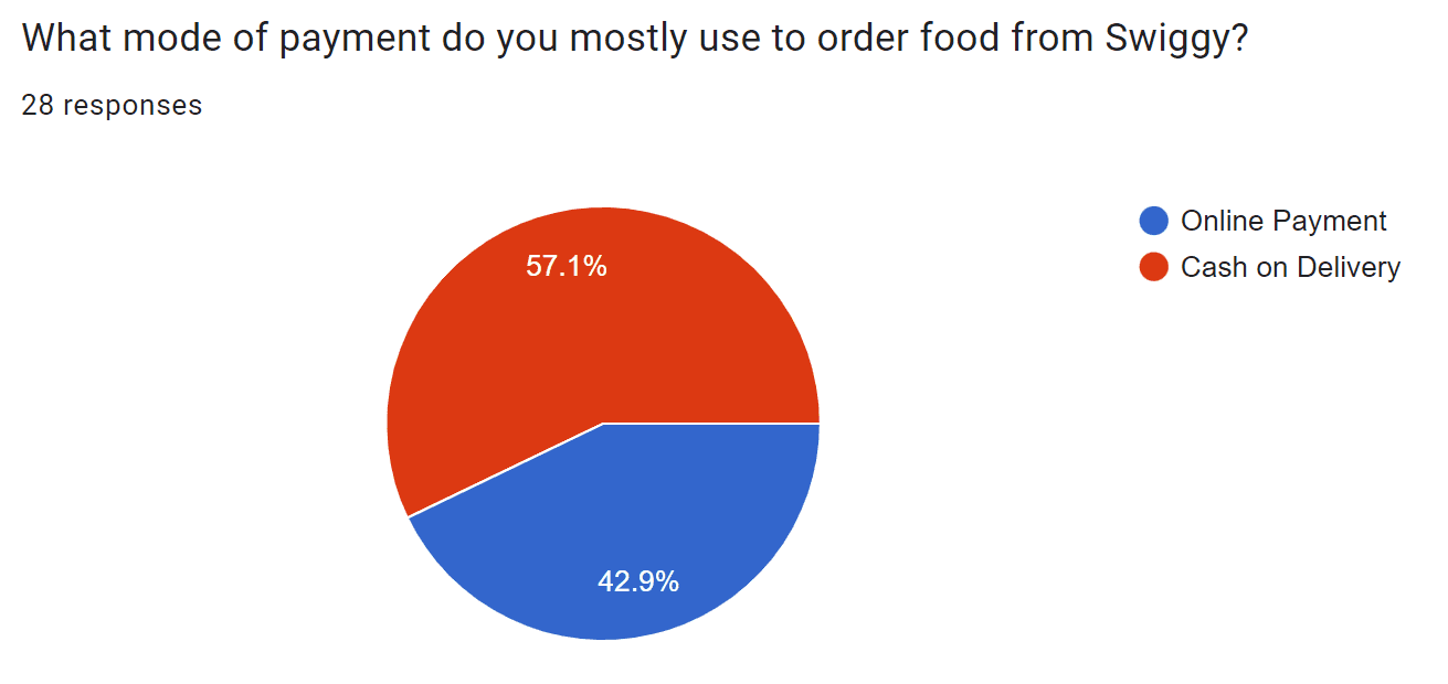
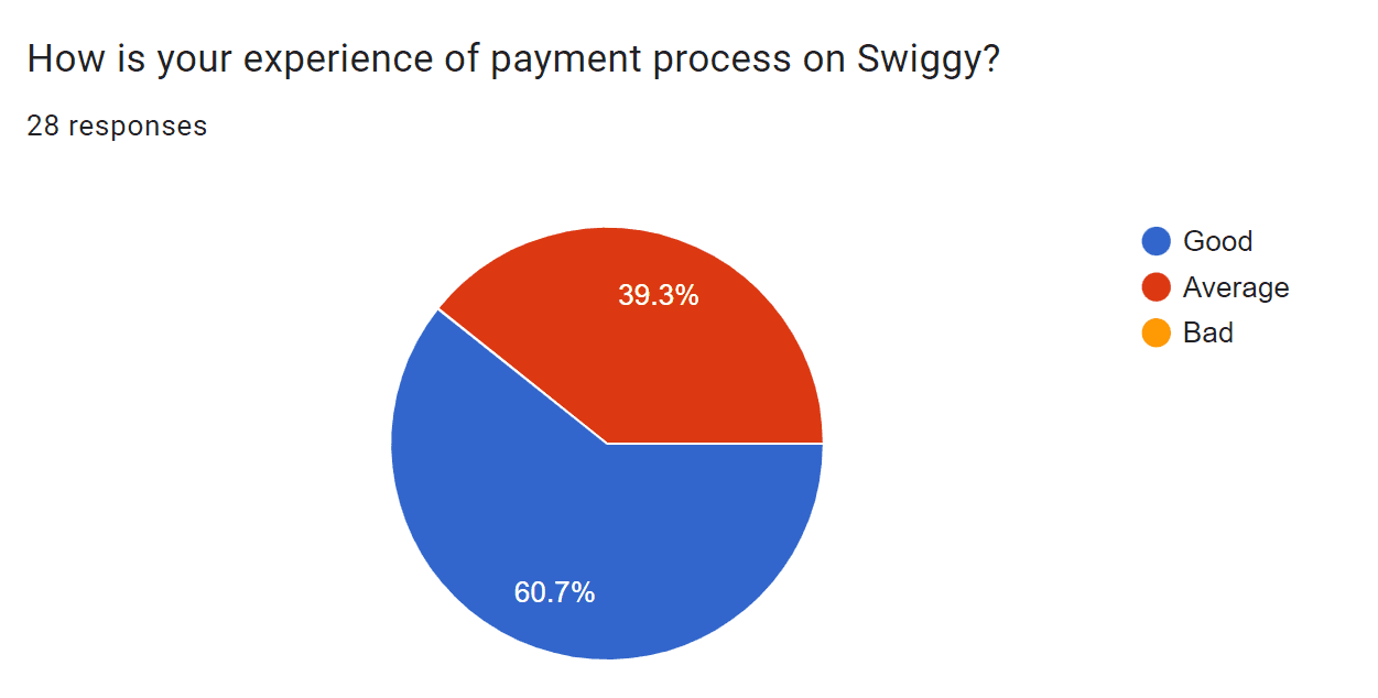
In research phase, I conducted Quantitative analysis with limited number of questions as goal of this research was to only get info on dominant payment mode on Swiggy and its payment experience.
Quantitative Research
For this approach, I used Google forms and distributed it to users who fall under the genre of ordering food online.
Research Insights
According to my research, in this era of e-commerce and digital world, cash on delivery (COD) is still dominant payment mode on Swiggy.
However, around 60% of users claim that payment flow of Swiggy is good and the rest of them believe it is average (approx. 40%)
This indicates that the payment flow of Swiggy needs to be redesigned.
While COD is the most preferred mode of payment, it needs to be worked upon along with the interface.
DEFINE
User Story
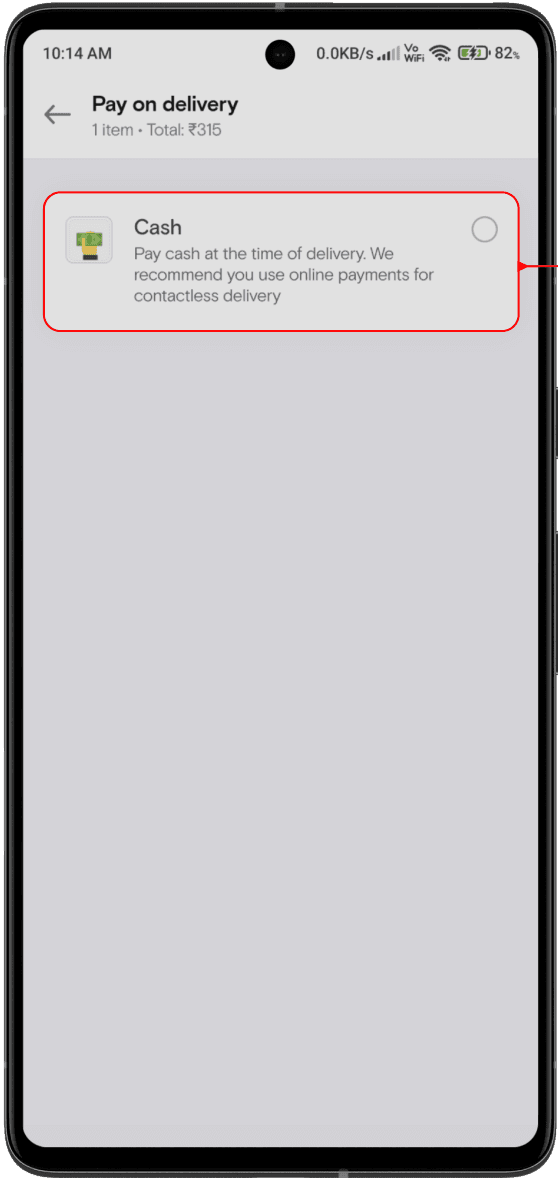
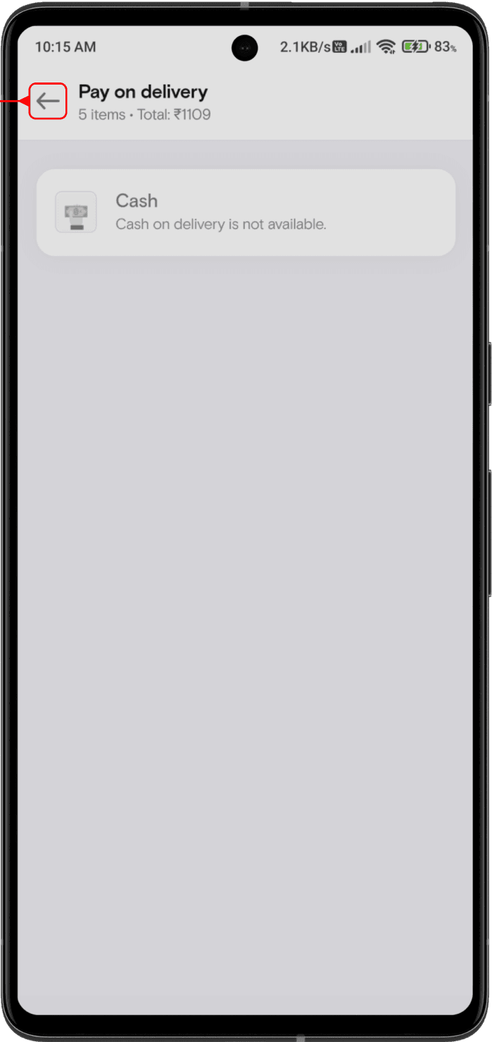
It was a Sunday evening when Jill decided to order food online as his parents were away from home. Jill opened Swiggy and surfed through many restaurants to find his favorite meal. After selecting food items, Jill went through payment section of Swiggy where he was offered lot of options to pay with. He selected COD (cash on delivery) which took him to another screen where it displayed that COD was not available at that moment. Hence, Jill immediately closed the app and used some another platform to order food as he was very hungry.
Problems
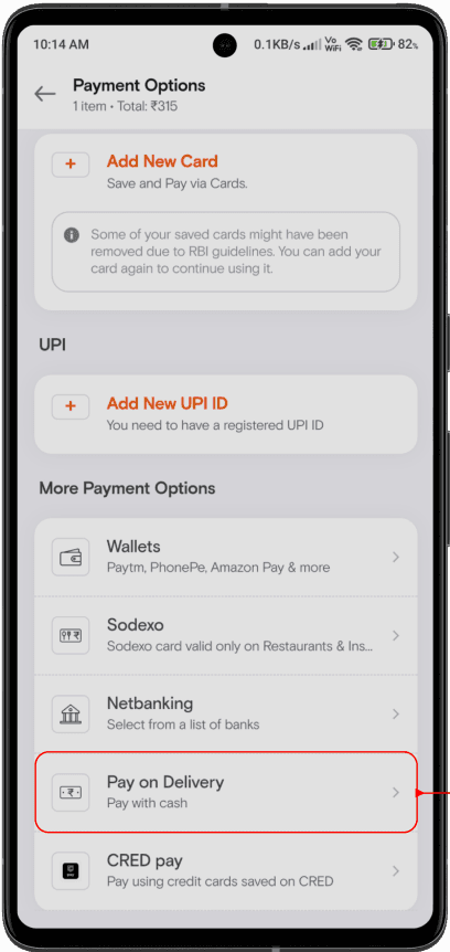
Jill had to take 3 steps to make payment (if COD was available) which is not meaningful according to me
Jill was never shown an option/suggestion to make online payment when COD was unavailable.
If COD was unavailable, then Jill should’ve been informed about it on the same screen rather than redirecting him to another screen and showing unavailability there.
RESEARCH
In research phase, I conducted Quantitative analysis with limited number of questions as goal of this research was to only get info on dominant payment mode on Swiggy and its payment experience.
Quantitative Research
For this approach, I used Google forms and distributed it to users who fall under the genre of ordering food online.
Research Insights
According to my research, in this era of e-commerce and digital world, cash on delivery (COD) is still dominant payment mode on Swiggy.
However, around 60% of users claim that payment flow of Swiggy is good and the rest of them believe it is average (approx. 40%)
This indicates that the payment flow of Swiggy needs to be redesigned.
While COD is the most preferred mode of payment, it needs to be worked upon along with the interface.
DEFINE
User Story
It was a Sunday evening when Jill decided to order food online as his parents were away from home. Jill opened Swiggy and surfed through many restaurants to find his favorite meal. After selecting food items, Jill went through payment section of Swiggy where he was offered lot of options to pay with. He selected COD (cash on delivery) which took him to another screen where it displayed that COD was not available at that moment. Hence, Jill immediately closed the app and used some another platform to order food as he was very hungry.
Problems
Jill had to take 3 steps to make payment (if COD was available) which is not meaningful according to me
Jill was never shown an option/suggestion to make online payment when COD was unavailable.
If COD was unavailable, then Jill should’ve been informed about it on the same screen rather than redirecting him to another screen and showing unavailability there.
IDEATE
I created some solutions with iterations for the above mentioned problems respectively.
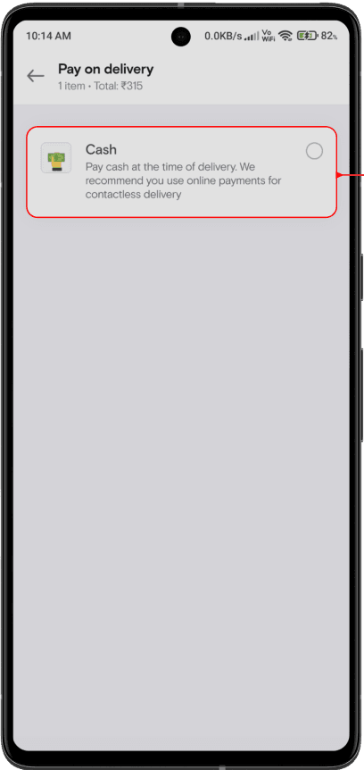
Solution-1 for Problem-1
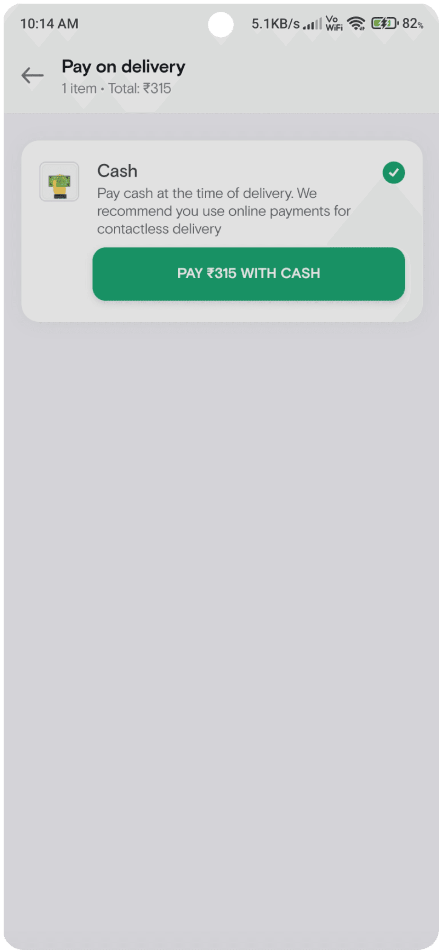
Wallets
Paytm, PhonePe, Amazon Pay and more
Sodexo card valid only on Restaurants &Ins titutes
Select from a list of banks
Pay with cash
Pay using credit cards saved on CRED
Sodexo
Netbanking
Pay on Delivery
CRED pay


Cash
Pay cash at the time of delivery. We recommend you use online payments for contactless delivery.
PAY ₹315 WITH CASH
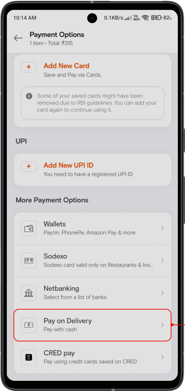
In the first solution, I reduced 1 step for user by implementing payment option as a dropdown of ‘Pay on Delivery’ section.
This makes it easy for user to do payment without being redirected to another screen.
Moreover, it is also feasible for developers as no other screen has to be developed for payment.
However, according to my research, COD is a dominant payment mode on Swiggy. Hence this solution is not much reliable as it doesn’t get exposure as compared to online payment option and also it has a drop-down mechanism which breaks the design consistency.
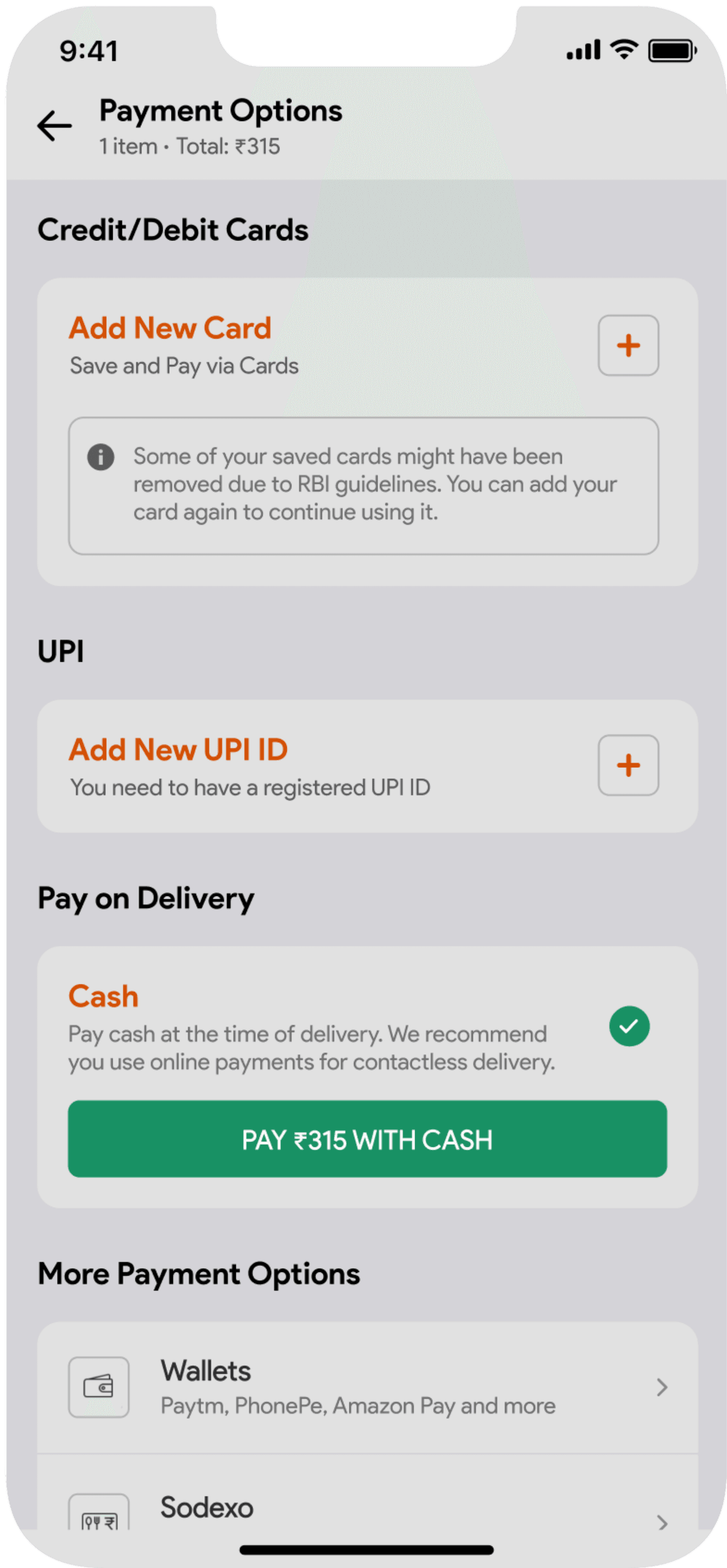
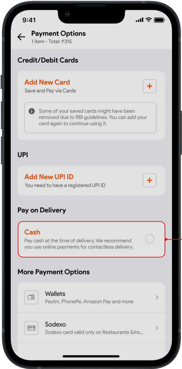
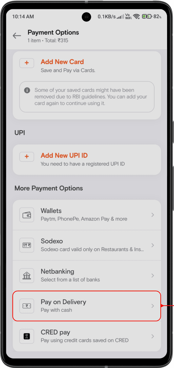
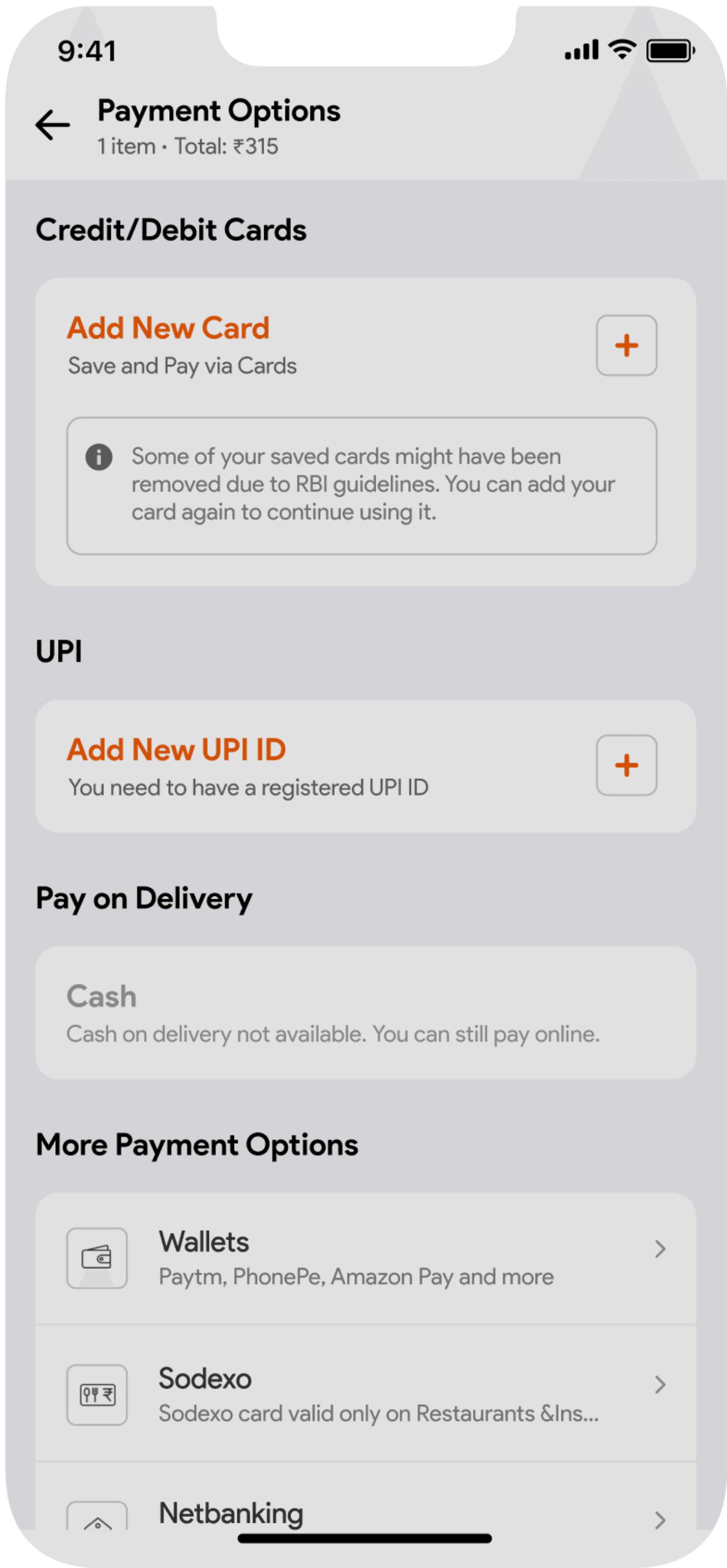
Solution-2 for Problem-1
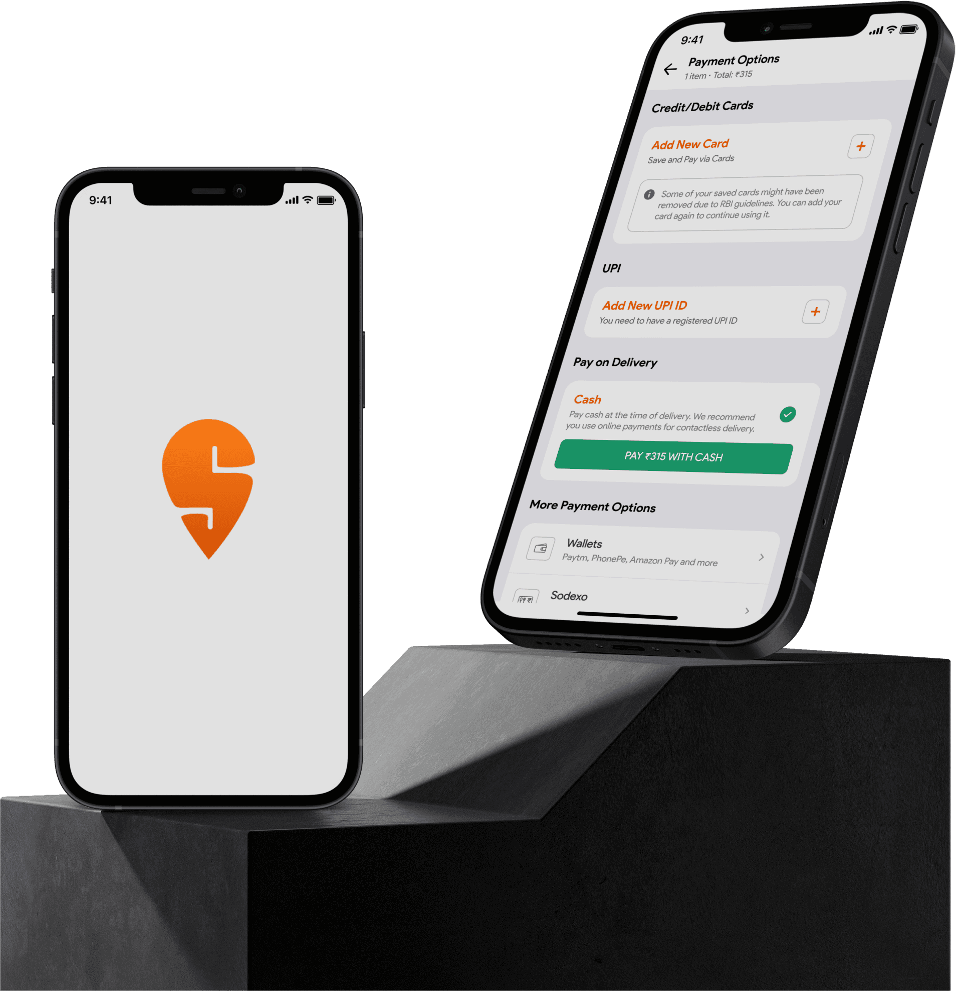
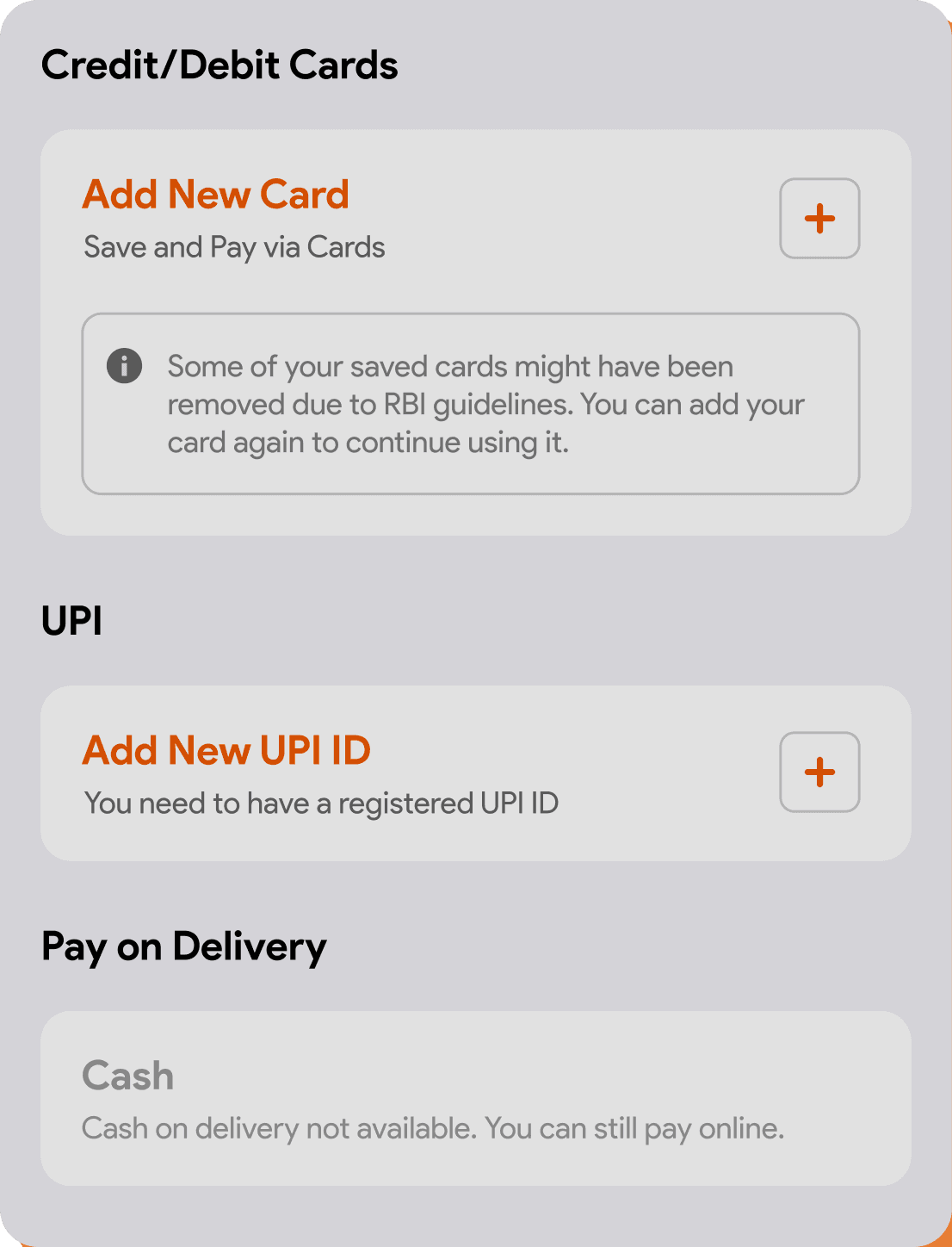
UPI
Credit/Debit Cards
Save and Pay via Cards
You need to have a registered UPI ID
Some of your saved cards might have been removed due to RBI guidelines. You can add your card again to continue using it.
Add New Card
Add New UPI ID
Cash
Pay cash at the time of delivery. We recommend you use online payments for contactless delivery.
Pay on Delivery
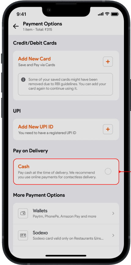
In this solution, I designed COD option in primary payment section with a radio button to overcome the issue of first solution.
I designed this solution taking into consideration that COD is dominant payment mode on Swiggy.
This gives exposure to COD option and also creates feasible environment for both users and developers.
According to me, this is a better user-centered design solution as compared to the first solution.
Solution for Problems-2 & 3
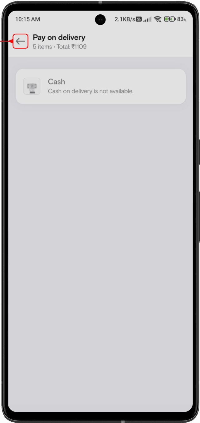
With respect to problem-2, if COD is not available then it is shown to the user on that screen only and no redirection to another screen is required..
This makes it easy for user to become aware about the unavailability of COD without taking an extra useless step.
For problem-3, If COD is unavailable then the user is suggested to make online payment which is very important information to be provided to the user.
Apart from these solutions, I also made some changes to the interface of the screen to make it more aesthetic and consistent. It included changing corner radius of cards, position of icon inside the cards and shape of icon by making it rounded.
IDEATE
I created some solutions with iterations for the above mentioned problems respectively.
Solution-1 for Problem-1
Wallets
Paytm, PhonePe, Amazon Pay and more
Sodexo card valid only on Restaurants &Ins titutes
Select from a list of banks
Pay with cash
Pay using credit cards saved on CRED
Sodexo
Netbanking
Pay on Delivery
CRED pay
Cash
Pay cash at the time of delivery. We recommend you use online payments for contactless delivery.
PAY ₹315 WITH CASH
In the first solution, I reduced 1 step for user by implementing payment option as a dropdown of ‘Pay on Delivery’ section.
This makes it easy for user to do payment without being redirected to another screen.
Moreover, it is also feasible for developers as no other screen has to be developed for payment.
However, according to my research, COD is a dominant payment mode on Swiggy. Hence this solution is not much reliable as it doesn’t get exposure as compared to online payment option and also it has a drop-down mechanism which breaks the design consistency.
Solution-2 for Problem-1
UPI
Credit/Debit Cards
Save and Pay via Cards
You need to have a registered UPI ID
Some of your saved cards might have been removed due to RBI guidelines. You can add your card again to continue using it.
Add New Card
Add New UPI ID
Cash
Pay cash at the time of delivery. We recommend you use online payments for contactless delivery.
Pay on Delivery
In this solution, I designed COD option in primary payment section with a radio button to overcome the issue of first solution.
I designed this solution taking into consideration that COD is dominant payment mode on Swiggy.
This gives exposure to COD option and also creates feasible environment for both users and developers.
According to me, this is a better user-centered design solution as compared to the first solution.
Solution for Problems-2 & 3
With respect to problem-2, if COD is not available then it is shown to the user on that screen only and no redirection to another screen is required..
This makes it easy for user to become aware about the unavailability of COD without taking an extra useless step.
For problem-3, If COD is unavailable then the user is suggested to make online payment which is very important information to be provided to the user.
Apart from these solutions, I also made some changes to the interface of the screen to make it more aesthetic and consistent. It included changing corner radius of cards, position of icon inside the cards and shape of icon by making it rounded.
DESIGN
Here are the final high fidelity screens for the above proposed solutions which solve the respective problems as compared to the current design.
Payment Screen (COD FLow)
Current Design
screen-1
screen-2
screen-2


Redesign Proposal
screen-1
screen-1
COD Unavailable Screen
Current Design
screen-1
screen-2
Redesign Proposal
screen-1
Conclusion
Conclusion
I understood how to solve UX problems like the one mentioned above and implemented one of the various solutions to enhance the user experience.
After I uploaded my redesign case study, Swiggy actually made some changes on their payment flow, not the same solution as mine but still it might be inspired from my redesign.
DESIGN PROCESS
Research
define
ideate
design
prototype
DESIGN
Here are the final high fidelity screens for the above proposed solutions which solve the respective problems as compared to the current design.
Payment Screen (COD FLow)
Current Design
screen-1
screen-2
screen-2
Redesign Proposal
screen-1
screen-1
COD Unavailable Screen
Current Design
screen-1
screen-2
Redesign Proposal
screen-1