
01
AI-Assisted Data Extraction
Dashboard for Mayo Clinic
Product Design, UX Research
AI-Assisted Data Extraction
Dashboard for Mayo Clinic
Product Design, UX Research
Overview
Overview
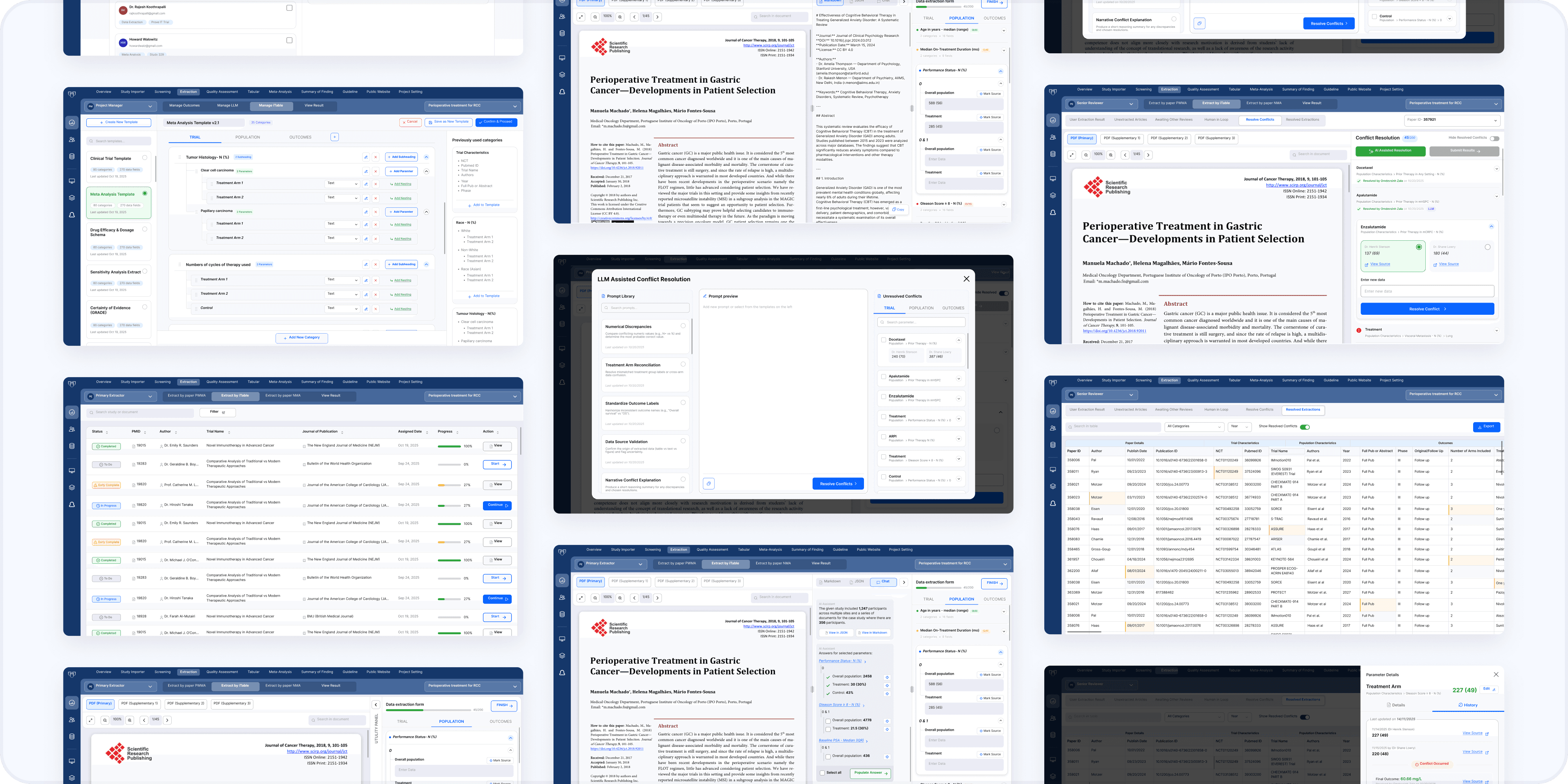
Designing a Human-AI collaborative platform that helps medical researchers extract and verify clinical trial data faster, without compromising the transparency that scientific evidence demands.
The platform reimagines a process that traditionally took days of manual setup and cross-referencing, replacing it with a role-based workflow where AI acts as a transparent, verifiable assistant rather than a black box. Every extracted data point remains traceable back to its exact source, ensuring reviewers never have to choose between speed and accuracy.
Designing a Human-AI collaborative platform that helps medical researchers extract and verify clinical trial data faster, without compromising the transparency that scientific evidence demands.
The platform reimagines a process that traditionally took days of manual setup and cross-referencing, replacing it with a role-based workflow where AI acts as a transparent, verifiable assistant rather than a black box. Every extracted data point remains traceable back to its exact source, ensuring reviewers never have to choose between speed and accuracy.
My Role
My Role
Product Design
Product Design
User Research
User Research
Stakeholder Collaboration
Stakeholder Collaboration
AI-UX Strategy
AI-UX Strategy
Design System
Design System
Client: Mayo Clinic
Client: Mayo Clinic
Tools: Figma, FigJam, Google Forms
Tools: Figma, FigJam, Google Forms
Duration: 2 months
Duration: 2 months
The Problem
The Problem
“Living Systematic Reviews (LSRs) are meant to keep medical evidence continuously current, but the process that powers them is stuck in the past. Manual data extraction from clinical trial PDFs is slow, error-prone, and heavily dependent on outdated tools, directly contributing to delays in getting validated research into clinical practice.”
“Living Systematic Reviews (LSRs) are meant to keep medical evidence continuously current, but the process that powers them is stuck in the past. Manual data extraction from clinical trial PDFs is slow, error-prone, and heavily dependent on outdated tools, directly contributing to delays in getting validated research into clinical practice.”
Business Problem
Business Problem
Medical literature is growing exponentially, but the systems that translate research into clinical guidelines haven't kept pace.
Medical literature is growing exponentially, but the systems that translate research into clinical guidelines haven’t kept pace.
This can be seen in a documented 17-year gap between validated research and patient care.
This can be seen in a documented 17-year gap between validated research and patient care.
Data extraction is one of the biggest bottlenecks in the review pipeline.
Data extraction is one of the biggest bottlenecks in the review pipeline.
Requires dual independent expert reviewers, adding significant resource cost.
Requires dual independent expert reviewers, adding significant resource cost.
Reviews take weeks to months to complete, delaying guideline updates.
Reviews take weeks to months to complete, delaying guideline updates.
User Problem
User Problem
Building a single extraction table can take 4-5 days.
Building a single extraction table can take 4-5 days.
No way to view a source PDF alongside the data entry form, forcing reliance on a second monitor.
No way to view a source PDF alongside the data entry form, forcing reliance on a second monitor.
No way to reference source material during conflict resolution, the highest-stakes step.
No way to reference source material during conflict resolution, the highest-stakes step.
The AI feature meant to help runs as a disconnected batch process.
The AI feature meant to help runs as a disconnected batch process.
Batch AI results can take up to 24 hours to return, making the tool feel disconnected from the actual workflow.
Batch AI results can take up to 24 hours to return, making the tool feel disconnected from the actual workflow.
RESEARCH
user roles
user roles
Who I Designed For
Who I Designed For
Research was organized around three distinct roles in the review process, each interacting with the product in a completely different way and caring about different things.
Research was organized around three distinct roles in the review process, each interacting with the product in a completely different way and caring about different things.
Project Manager
Project Manager
Builds extraction templates and assigns reviewers and AI agents to papers.
Builds extraction templates and assigns reviewers and AI agents to papers.
Data Extractor
Data Extractor
Reads clinical trial PDFs and pulls out structured data points.
Reads clinical trial PDFs and pulls out structured data points.
Senior Reviewer
Senior Reviewer
Resolves conflicts between two independent extractions.
Resolves conflicts between two independent extractions.
RESEARCH
current system audit
current system audit
Understanding the Platform
Understanding the Platform
Before designing anything new, I audited the platform currently used by Mayo Clinic's review teams. Walking through real screens with an active user surfaced specific, concrete failures, giving a clear list of problems to design against rather than assumptions to design around.
Before designing anything new, I audited the platform currently used by Mayo Clinic’s review teams. Walking through real screens with an active user surfaced specific, concrete failures, giving a clear list of problems to design against rather than assumptions to design around.
Before designing anything new, I audited the platform currently used by Mayo Clinic’s review teams. Walking through real screens with an active user surfaced specific, concrete failures, giving a clear list of problems to design against rather than assumptions to design around.
iTable Creation
iTable Creation
Project Manager
Project Manager

Pain points
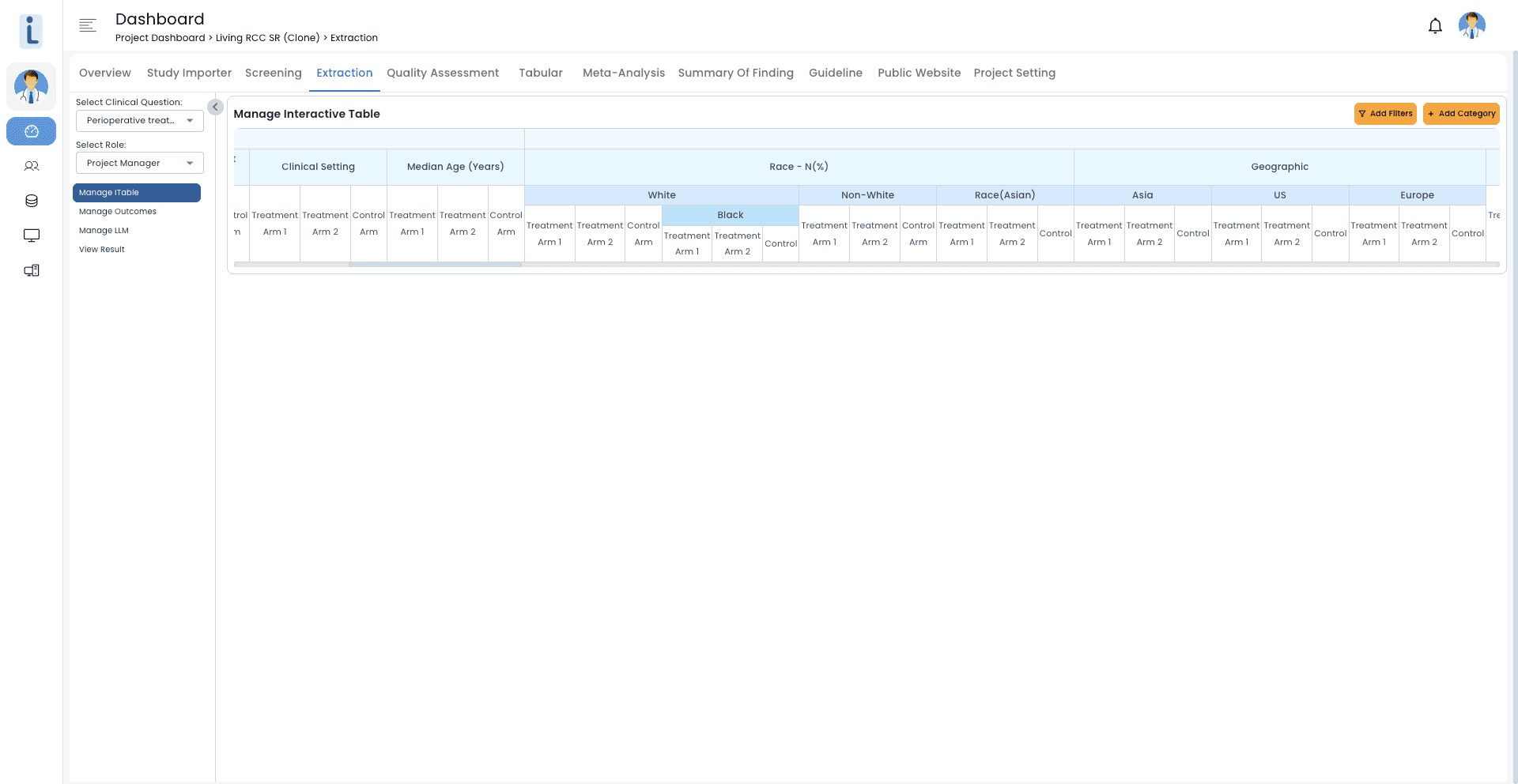
Only a small drawer UI is provided for table creation.
Repeating structures must be re-created every time.
Small buttons make the interaction against accessibility guidelines.
No visual distinction between finalized and in-progress parts of the headings and parameters.
design opportunity
“Replace the drawer with a full, accessible workspace for table creation, and turn repeating structures into reusable templates applied in one action."
“Replace the drawer with a full, accessible workspace for table creation, and turn repeating structures into reusable templates applied in one action.”
Data Extraction
Data Extraction
Data Extractor
Data Extractor
Pain points
Only 1st row gets filled with data which creates extreme horizontal width, requiring constant scrolling.
User requires another window or separate monitor to view source PDF for extracting data.
So much real estate (whitespace) gets wasted on the screen.
design opportunity
“Bring the source PDF directly into the extraction screen, and use the unused space for a focused, collapsible field view instead of a wide, mostly empty table.”
“Bring the source PDF directly into the extraction screen, and use the unused space for a focused, collapsible field view instead of a wide, mostly empty table.”
LLM Prompt Creation
LLM Prompt Creation
Data Extractor
Data Extractor
Pain points
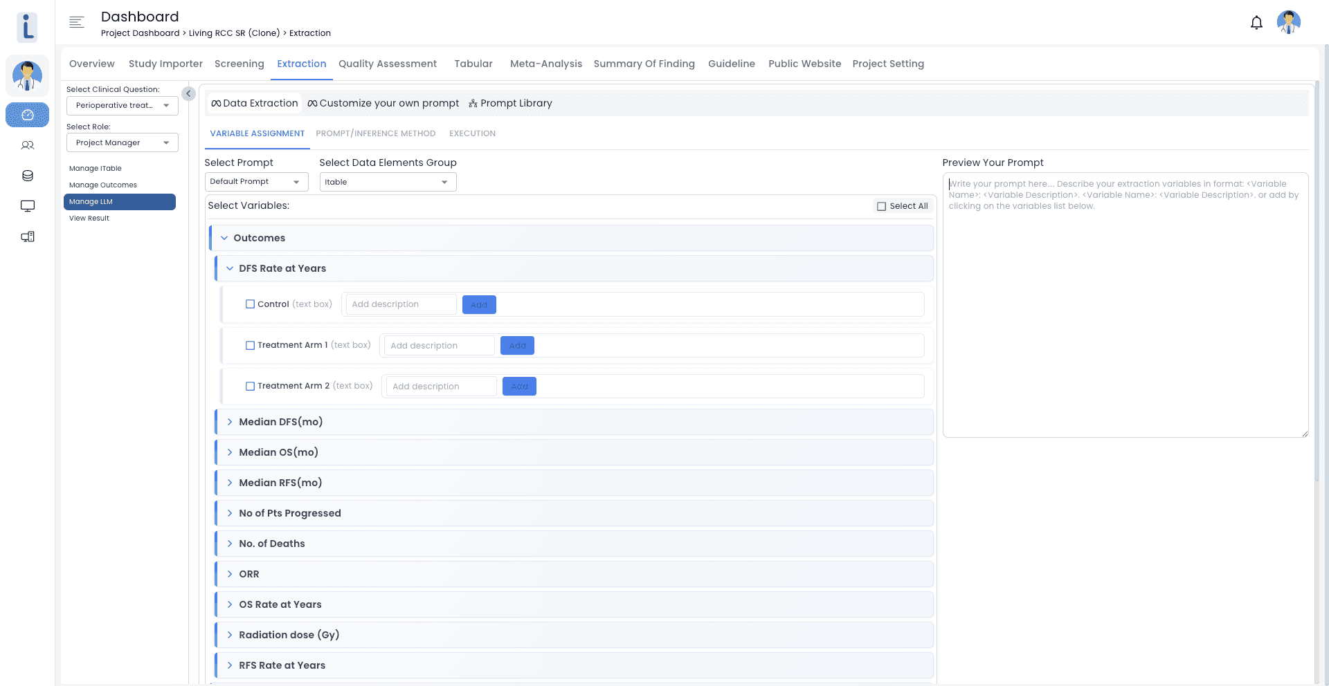
Building a prompt requires manually selecting variables one by one from a long, nested list.
No visible connection between this setup screen and the actual extraction form the user works in.
Text, color & filed size fail accessibility guidelines.
design opportunity
“Turn prompt creation into a guided, template-driven step directly inside the extraction workspace, instead of a separate manual configuration screen.”
“Turn prompt creation into a guided, template-driven step directly inside the extraction workspace, instead of a separate manual configuration screen.”
Conflict Resolution
Conflict Resolution
Senior Reviewer
Senior Reviewer

Pain points
No source document visible anywhere on screen, conflicts are resolved on numbers alone.
Reviewer names are shown but not their reasoning or where the value came from.
No text or color hierarchy is followed for presenting information.
design opportunity
“Bring the source PDF into the conflict view alongside each entry, and use clear hierarchy and status color so reviewers always know what's active versus resolved.”
“Bring the source PDF into the conflict view alongside each entry, and use clear hierarchy and status color so reviewers always know what’s active versus resolved.”
research methods
Learning from Actual Users
With direct access to the people who use this system daily, I focused on qualitative research rather than large-scale surveys. I wanted to understand the friction in their day-to-day workflow.
1:1 Interviews
6+ users spanning all three roles
Direct Observation
Watched real extractions happen live
Co-Creation
Worked alongside Mayo's subject matter experts as design partners
Async Feedback
Gathered across multiple prototype fidelities
Key Insights from Research
AI trust is real, but it has to be earned
Nearly every reviewer had experimented with AI in some capacity, yet none felt comfortable relying on it directly. The issue wasn't whether the AI was right, it was whether they could quickly confirm that it was.
"I don't mind the AI being wrong sometimes. I mind not being able to check it quickly." - Senior Reviewer
Nearly every reviewer had experimented with AI in some capacity, yet none felt comfortable relying on it directly. The issue wasn’t whether the AI was right, it was whether they could quickly confirm that it was.
“I don’t mind the AI being wrong sometimes. I mind not being able to check it quickly.” - Senior Reviewer
The spreadsheet is the default mental model
Years spent in Excel had shaped how reviewers expect data to behave. Interfaces that departed too far from a grid felt unfamiliar and hard to trust, yet that same grid left them without the context they needed, since the PDF, the data, and the source were never in one place.
A lot of critical data is hiding in plain sight
One finding I hadn't anticipated: significant amounts of trial data sit in supplementary appendices rather than the primary paper. The existing system only allowed one PDF per trial, meaning this data was effectively invisible. This single observation became the reasoning behind the multi-document tab structure in the final design.
One finding I hadn’t anticipated: significant amounts of trial data sit in supplementary appendices rather than the primary paper. The existing system only allowed one PDF per trial, meaning this data was effectively invisible. This single observation became the reasoning behind the multi-document tab structure in the final design.
What to Improve
Remove the need for a second screen by bringing the PDF directly into the interface.
Create a clear, traceable link between every extracted field and its source.
Bring scattered screens together into one workflow that adapts to each role.
Keep a visible history of how each data point changed over time.
Cut down template setup time so project managers aren't blocked.
What to Add
LLM integration that stays transparent, with no unexplained outputs.
Support for multiple linked documents per trial, covering both primary and supplementary sources.
Visibility into reviewer workload for fairer task distribution.
An early completion option for studies where certain fields simply don't apply.
A conflict resolution screen that mirrors the extraction screen, so reviewers don't have to relearn the interface.
research methods
Learning from Actual Users
With direct access to the people who use this system daily, I focused on qualitative research rather than large-scale surveys. I wanted to understand the friction in their day-to-day workflow.
1:1 Interviews
6+ users spanning all three roles
Direct Observation
Watched real extractions happen live
Co-Creation
Worked alongside Mayo’s subject matter
experts as design partners
Async Feedback
Gathered across multiple prototype fidelities
Key Insights from Research
AI trust is real, but it has to be earned
Nearly every reviewer had experimented with AI in some capacity, yet none felt comfortable relying on it directly. The issue wasn’t whether the AI was right, it was whether they could quickly confirm that it was.
“I don’t mind the AI being wrong sometimes. I mind not being able to check it quickly.” - Senior Reviewer
The spreadsheet is the default mental model
Years spent in Excel had shaped how reviewers expect data to behave. Interfaces that departed too far from a grid felt unfamiliar and hard to trust, yet that same grid left them without the context they needed, since the PDF, the data, and the source were never in one place.
A lot of critical data is hiding in plain sight
One finding I hadn’t anticipated: significant amounts of trial data sit in supplementary appendices rather than the primary paper. The existing system only allowed one PDF per trial, meaning this data was effectively invisible. This single observation became the reasoning behind the multi-document tab structure in the final design.
What to Improve
Remove the need for a second screen by bringing the PDF directly into the interface.
Create a clear, traceable link between every extracted field and its source.
Bring scattered screens together into one workflow that adapts to each role.
Keep a visible history of how each data point changed over time.
Cut down template setup time so project managers aren’t blocked.
What to Add
LLM integration that stays transparent, with no unexplained outputs.
Support for multiple linked documents per trial, covering both primary and supplementary sources.
Visibility into reviewer workload for fairer task distribution.
An early completion option for studies where certain fields simply don’t apply.
A conflict resolution screen that mirrors the extraction screen, so reviewers don’t have to relearn the interface.
IDEATION
sketches
sketches
Starting on Paper
Starting on Paper
I began on paper, deliberately keeping things rough. No fidelity, no early commitment, just sketches exploring fundamentally different ways the workflow could be structured. At this stage, the goal wasn't to land on an answer. It was to map out the range of possible answers so the real trade-offs between them could actually surface.
I began on paper, deliberately keeping things rough. No fidelity, no early commitment, just sketches exploring fundamentally different ways the workflow could be structured. At this stage, the goal wasn’t to land on an answer. It was to map out the range of possible answers so the real trade-offs between them could actually surface.
I began on paper, deliberately keeping things rough. No fidelity, no early commitment, just sketches exploring fundamentally different ways the workflow could be structured. At this stage, the goal wasn’t to land on an answer. It was to map out the range of possible answers so the real trade-offs between them could actually surface.
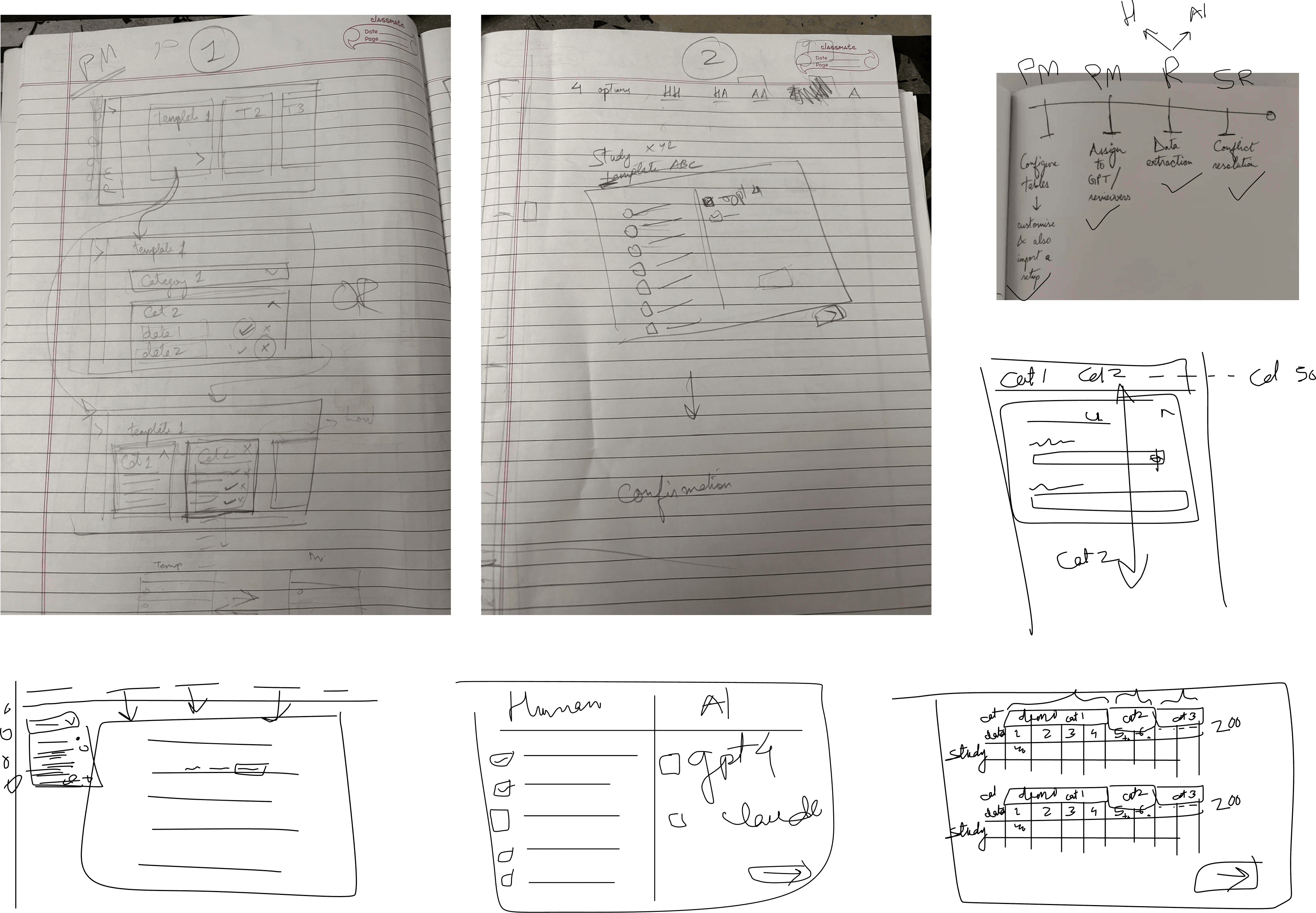
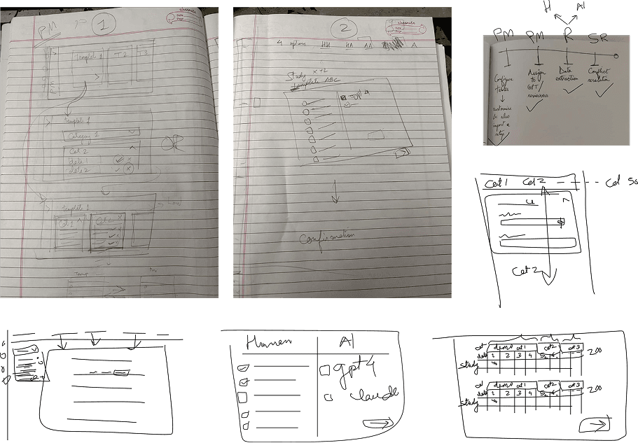
Three distinct directions kept emerging across the sketches, each testing a different axis of the problem: simplicity, flexibility, and contextual awareness.
A linear, step-by-step flow that walks reviewers through one task at a time.
A multi-panel dashboard that surfaces everything at once, closer to how reviewers already work in Excel.
A trial-centric timeline structured around the ongoing, longitudinal life of a clinical trial, rather than individual papers.
Three distinct directions kept emerging across the sketches, each testing a different axis of the problem: Simplicity, Flexibility, and Contextual Awareness.
A linear, step-by-step flow that walks reviewers through one task at a time.
A multi-panel dashboard that surfaces everything at once, closer to how reviewers already work in Excel.
A trial-centric timeline structured around the ongoing, longitudinal life of a clinical trial, rather than individual papers.
IDEATION
Iterations
Iterations
Translating Sketches into Structure
Translating Sketches into Structure
Each of the three directions from the sketching phase was built out as wireframes. This helped testing the actual logic of the workflow, how a reviewer would move through the screens, without visual design distracting from whether the structure itself made sense.
Each of the three directions from the sketching phase was built out as wireframes. This helped testing the actual logic of the workflow, how a reviewer would move through the screens, without visual design distracting from whether the structure itself made sense.
Concept 1: The Linear Flow
Concept 1: The Linear Flow
A guided, step-by-step wizard that walks the reviewer through project setup, document upload, and one-paper-at-a-time extraction, followed by a sequential conflict queue. Built around templates and smart defaults to keep cognitive load low.
A guided, step-by-step wizard that walks the reviewer through project setup, document upload, and one-paper-at-a-time extraction, followed by a sequential conflict queue. Built around templates and smart defaults to keep cognitive load low.






Concept 2: The Modular Dashboard
Concept 2: The Modular Dashboard
A multi-panel command center combining a document library, a spreadsheet-style extraction table, and a flexible context panel for viewing sources or resolving conflicts, all in one customizable workspace.
A multi-panel command center combining a document library, a spreadsheet-style extraction table, and a flexible context panel for viewing sources or resolving conflicts, all in one customizable workspace.


Concept 3: The Trial-Centric Timeline
Concept 3: The Trial-Centric Timeline
Organized around the clinical trial itself rather than individual papers. Trials appear as visual timelines, with each extraction screen showing historical context from earlier publications to help maintain consistency across a trial's lifespan.
Organized around the clinical trial itself rather than individual papers. Trials appear as visual timelines, with each extraction screen showing historical context from earlier publications to help maintain consistency across a trial’s lifespan.
Organized around the clinical trial itself rather than individual papers. Trials appear as visual timelines, with each extraction screen showing historical context from earlier publications to help maintain consistency across a trial’s lifespan.


DESIGN
DESIGN SYSTEM
DESIGN SYSTEM
Building the Visual Foundation
Building the Visual Foundation
With reviewers spending hours at a time inside this interface, the visual system had to support focus, not fight for attention. Every choice, from color to spacing, was made to reduce fatigue and keep dense, information-heavy screens easy to read.
With reviewers spending hours at a time inside this interface, the visual system had to support focus, not fight for attention. Every choice, from color to spacing, was made to reduce fatigue and keep dense, information-heavy screens easy to read.

Color: A functional palette built around blue for primary actions, green for success and AI-assisted states, and gray for neutral or disabled states, keeping meaning consistent across every screen.
Color: A functional palette built around blue for primary actions, green for success and AI-assisted states, and gray for neutral or disabled states, keeping meaning consistent across every screen.
Typography: A clear type scale from Title through body text, using weight (Book, Medium, Bold) rather than size alone to establish hierarchy.
Typography: A clear type scale from Title through body text, using weight (Book, Medium, Bold) rather than size alone to establish hierarchy.
Iconography: A consistent icon set covering navigation, actions, status, and communication, keeping visual language uniform across every workflow stage.
Iconography: A consistent icon set covering navigation, actions, status, and communication, keeping visual language uniform across every workflow stage.
Buttons: A defined set of button states, primary, secondary, destructive, success, and AI-assisted, so users can recognize the weight of an action at a glance.
Buttons: A defined set of button states, primary, secondary, destructive, success, and AI-assisted, so users can recognize the weight of an action at a glance.
Form Fields: Standardized input fields with clear label, placeholder, and error states, keeping data entry predictable across every extraction screen.
Form Fields: Standardized input fields with clear label, placeholder, and error states, keeping data entry predictable across every extraction screen.
Components: Reusable card patterns for reviewers, conflicts, and templates, each following the same structure so information stays easy to scan regardless of context.
Components: Reusable card patterns for reviewers, conflicts, and templates, each following the same structure so information stays easy to scan regardless of context.
DESIGN
the solution
Six Flows, One System
Every concept, insight, and piece of feedback converged into a single role-based platform. Instead of one generic interface, the system moves reviewers through six connected flows, each designed around a specific role and a specific point of friction in the original workflow.
01
Template Configuration
Turning a two-to-three day setup task into a fast, template-driven process.
02
Reviewer Assignment
Giving project managers a clear way to route studies to the right reviewers - Human or AI.
03
Reviewer Dashboard
A single, unified view of every study assigned to a reviewer.
04
Data Extraction
The core workspace where source and data finally live side by side.
05
Conflict Resolution
Resolving disagreements with full source visibility instead of guesswork.
06
Final Table
A living, traceable record of every data point, not just a static export.
the solution
Six Flows, One System
Every concept, insight, and piece of feedback converged into a single role-based platform. Instead of one generic interface, the system moves reviewers through six connected flows, each designed around a specific role and a specific point of friction in the original workflow.
01
Template Configuration
Turning a two-to-three day setup task into a fast, template-driven process.
02
Reviewer Assignment
Giving project managers a clear way to route studies to the right reviewers - Human or AI.
03
Reviewer Dashboard
A single, unified view of every study assigned to a reviewer.
04
Data Extraction
The core workspace where source and data finally live side by side.
05
Conflict Resolution
Resolving disagreements with full source visibility instead of guesswork.
06
Final Table
A living, traceable record of every data point, not just a static export.
Template Configuration
Template Configuration
Project Manager

Templates can be created from scratch or selected from a saved library, so setup effort isn't repeated across reviews.
Templates can be created from scratch or selected from a saved library, so setup effort isn’t repeated across reviews.
Templates can be created from scratch or selected from a saved library, so setup effort isn’t repeated across reviews.
Fields organize into tabbed categories (Trial, Population, Outcomes), each supporting nested subheadings and parameters for granular structure.
Fields organize into tabbed categories (Trial, Population, Outcomes), each supporting nested subheadings and parameters for granular structure.
A "Previously used categories" panel on the right lets project managers reuse existing category structures instead of rebuilding them field by field.
A “Previously used categories” panel on the right lets project managers reuse existing category structures instead of rebuilding them field by field.
A “Previously used categories” panel on the right lets project managers reuse existing category structures instead of rebuilding them field by field.
Templates can be created from scratch or selected from a saved library, so setup effort isn't repeated across reviews.
Templates can be created from scratch or selected from a saved library, so setup effort isn’t repeated across reviews.
Templates can be created from scratch or selected from a saved library, so setup effort isn’t repeated across reviews.
Every parameter has direct edit, delete, and add-nesting controls, giving fine-grained control without leaving the screen.
Every parameter has direct edit, delete, and add-nesting controls, giving fine-grained control without leaving the screen.
The form is designed to mirror what data extractors will later see, keeping the setup and extraction experience consistent.
The form is designed to mirror what data extractors will later see, keeping the setup and extraction experience consistent.
Reviewer Assignment
Reviewer Assignment
Project Manager

Human and AI reviewers appear side by side as equally selectable options, treating AI as a first-class reviewer rather than a hidden background process.
Human and AI reviewers appear side by side as equally selectable options, treating AI as a first-class reviewer rather than a hidden background process.
Each human reviewer's card shows relevant tags (e.g., "Data Extraction," "Meta Analysis," prior trial experience), helping managers assign based on expertise.
Each human reviewer’s card shows relevant tags (e.g., “Data Extraction,” “Meta Analysis,” prior trial experience), helping managers assign based on expertise.
Each human reviewer’s card shows relevant tags (e.g., “Data Extraction,” “Meta Analysis,” prior trial experience), helping managers assign based on expertise.
Multiple LLM engines can be selected individually, supporting flexible human-human or human-AI review combinations.
Multiple LLM engines can be selected individually, supporting flexible human-human or human-AI review combinations.
Template overview (categories, data fields) stays visible at the top, so assignment decisions are made with the full scope of the review in view.
Template overview (categories, data fields) stays visible at the top, so assignment decisions are made with the full scope of the review in view.
Reviewer Dashboard
Reviewer Dashboard
Data Extractor

Every assigned study appears in one unified list, with status, progress, and a direct action button, removing the need to hunt across screens for pending work.
Every assigned study appears in one unified list, with status, progress, and a direct action button, removing the need to hunt across screens for pending work.
Four distinct status states (To Do, In Progress, Early Complete, Completed) give extractors an honest, at-a-glance read on where each study stands.
Four distinct status states (To Do, In Progress, Early Complete, Completed) give extractors an honest, at-a-glance read on where each study stands.
Progress bars quantify completion for in-progress studies, so partial work is never invisible or ambiguous.
Progress bars quantify completion for in-progress studies, so partial work is never invisible or ambiguous.
Sortable columns (Status, PMID, Author, Trial Name, Assigned Date, Progress) let extractors organize their queue however fits their working style.
Sortable columns (Status, PMID, Author, Trial Name, Assigned Date, Progress) let extractors organize their queue however fits their working style.
A dedicated filter and search bar makes it fast to locate a specific study or trial within a large assigned list.
A dedicated filter and search bar makes it fast to locate a specific study or trial within a large assigned list.
Data Extraction
Data Extraction
Data Extractor
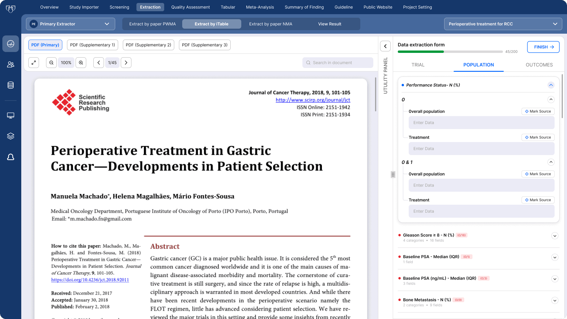
The source PDF and extraction form sit permanently side by side, removing the two-monitor dependency identified in the original system audit.
The source PDF and extraction form sit permanently side by side, removing the two-monitor dependency identified in the original system audit.
A "Mark Source" button sits next to every field, letting extractors link each entered value directly back to its exact location in the PDF.
A “Mark Source” button sits next to every field, letting extractors link each entered value directly back to its exact location in the PDF.
A “Mark Source” button sits next to every field, letting extractors link each entered value directly back to its exact location in the PDF.
The form is organized into tabbed categories (Trial, Population, Outcomes), with a live progress counter (45/200) tracking completion across the entire study.
The form is organized into tabbed categories (Trial, Population, Outcomes), with a live progress counter (45/200) tracking completion across the entire study.
Nested fields collapse and expand as needed, keeping a 200-field extraction manageable instead of overwhelming.
Nested fields collapse and expand as needed, keeping a 200-field extraction manageable instead of overwhelming.
Color-coded status dots (blue for active, red for incomplete) give a quick visual read on which fields still need attention.
Color-coded status dots (blue for active, red for incomplete) give a quick visual read on which fields still need attention.
4(a) - Source Marking
4(a) - Source Marking
This single mechanism is what made everything else in the workspace possible. Mark Source builds a direct, lasting connection between every piece of extracted data and the exact spot in the PDF it was pulled from.
This single mechanism is what made everything else in the workspace possible. Mark Source builds a direct, lasting connection between every piece of extracted data and the exact spot in the PDF it was pulled from.

There are three ways to create that connection, and all three lead to the same underlying link:
Enter the value first, then hit "Mark Source" and select the matching text in the document.
Activate "Mark Source" before typing anything, then highlight the text in the PDF, the field fills in on its own.
Highlight text in the PDF without pre-selecting a field, a "Click to Populate" option appears so you can send it to the right place.
Fields shift color as work progresses, red when empty, yellow when partially filled, and green once complete, so reviewers can always tell their status at a glance without guessing.
There are three ways to create that connection, and all three lead to the same underlying link:
Enter the value first, then hit “Mark Source” and select the matching text in the document.
Activate “Mark Source” before typing anything, then highlight the text in the PDF, the field fills in on its own.
Highlight text in the PDF without pre-selecting a field, a “Click to Populate” option appears so you can send it to the right place.
Fields shift color as work progresses, red when empty, yellow when partially filled, and green once complete, so reviewers can always tell their status at a glance without guessing.
There are three ways to create that connection, and all three lead to the same underlying link:
Enter the value first, then hit “Mark Source” and select the matching text in the document.
Activate “Mark Source” before typing anything, then highlight the text in the PDF, the field fills in on its own.
Highlight text in the PDF without pre-selecting a field, a “Click to Populate” option appears so you can send it to the right place.
Fields shift color as work progresses, red when empty, yellow when partially filled, and green once complete, so reviewers can always tell their status at a glance without guessing.
4(b) - Utility Panel
4(b) - Utility Panel
The utility panel takes the parsed document and makes it something you can actually work with, not just read.
The utility panel takes the parsed document and makes it something you can actually work with, not just read.

The panel offers three distinct modes:
Markdown: A clean, scrollable rendering of the paper's text. Clicking anything here jumps the PDF viewer straight to that spot, so navigation works in both directions at once.
The panel offers three distinct modes:
Markdown: A clean, scrollable rendering of the paper’s text. Clicking anything here jumps the PDF viewer straight to that spot, so navigation works in both directions at once.
The panel offers three distinct modes:
Markdown: A clean, scrollable rendering of the paper’s text. Clicking anything here jumps the PDF viewer straight to that spot, so navigation works in both directions at once.
JSON: The same content restructured for programmatic use, built for teams who need to plug extracted data into other tools or workflows.
JSON: The same content restructured for programmatic use, built for teams who need to plug extracted data into other tools or workflows.
Chat: An AI assistant that only knows what's in this specific paper, and every answer it gives links back to its source in the PDF through a "View Source" option.
Chat: An AI assistant that only knows what’s in this specific paper, and every answer it gives links back to its source in the PDF through a “View Source” option.
Chat: An AI assistant that only knows what’s in this specific paper, and every answer it gives links back to its source in the PDF through a “View Source” option.
4(c) - LLM Prompt Builder
4(c) - LLM Prompt Builder
An open-ended AI chat isn't precise enough for extraction work that's detailed and repeated across dozens of papers. The Prompt Builder gives reviewers a more structured way to query the model, built around templates rather than free-form typing.
An open-ended AI chat isn’t precise enough for extraction work that’s detailed and repeated across dozens of papers. The Prompt Builder gives reviewers a more structured way to query the model, built around templates rather than free-form typing.
An open-ended AI chat isn’t precise enough for extraction work that’s detailed and repeated across dozens of papers. The Prompt Builder gives reviewers a more structured way to query the model, built around templates rather than free-form typing.
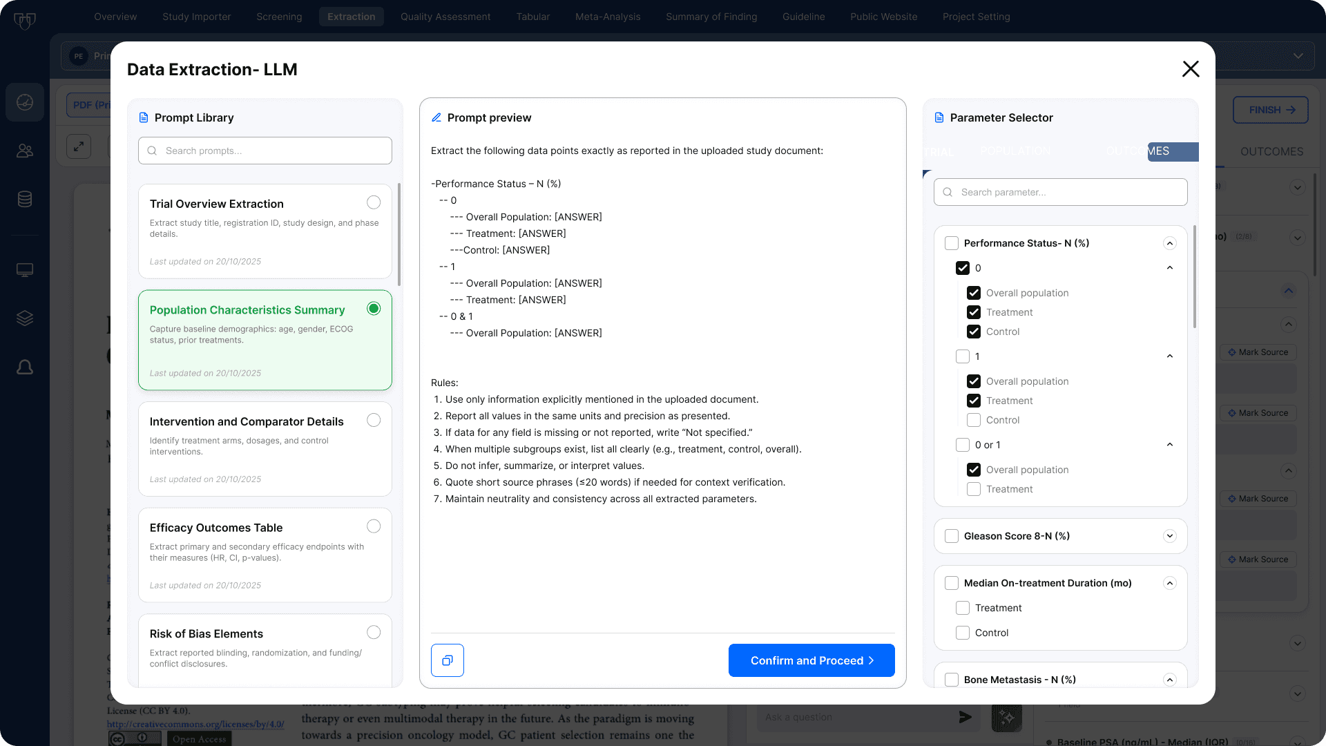
It's made up of three parts working together:
A library of ready-made prompt templates (Trial Overview, Population Summary, Outcomes Table, and others)
A parameter selector, where reviewers check off exactly which fields they want the model to pull
A center preview that updates live as selections change, and remains fully editable before running
It’s made up of three parts working together:
A library of ready-made prompt templates (Trial Overview, Population Summary, Outcomes Table, and others)
A parameter selector, where reviewers check off exactly which fields they want the model to pull
A center preview that updates live as selections change, and remains fully editable before running
It’s made up of three parts working together:
A library of ready-made prompt templates (Trial Overview, Population Summary, Outcomes Table, and others)
A parameter selector, where reviewers check off exactly which fields they want the model to pull
A center preview that updates live as selections change, and remains fully editable before running

Once a query runs, the results appear in the Chat panel with a checkbox beside each extracted value. Reviewers can select all of them or just a few, then use "Populate Answer" to send them into the form in bulk. Each value that gets populated keeps a "View Source" link pointing back to where it came from in the PDF. Nothing fills in automatically without that step, every AI-extracted value still needs a human to confirm it before it counts.
That last detail is really the whole philosophy behind this feature: AI here is a productivity layer, not a final authority. Every result can be checked. Every value is still the reviewer's call to accept or reject.
Once a query runs, the results appear in the Chat panel with a checkbox beside each extracted value. Reviewers can select all of them or just a few, then use “Populate Answer” to send them into the form in bulk. Each value that gets populated keeps a “View Source” link pointing back to where it came from in the PDF. Nothing fills in automatically without that step, every AI-extracted value still needs a human to confirm it before it counts.
That last detail is really the whole philosophy behind this feature: AI here is a productivity layer, not a final authority. Every result can be checked. Every value is still the reviewer’s call to accept or reject.
Once a query runs, the results appear in the Chat panel with a checkbox beside each extracted value. Reviewers can select all of them or just a few, then use “Populate Answer” to send them into the form in bulk. Each value that gets populated keeps a “View Source” link pointing back to where it came from in the PDF. Nothing fills in automatically without that step, every AI-extracted value still needs a human to confirm it before it counts.
That last detail is really the whole philosophy behind this feature: AI here is a productivity layer, not a final authority. Every result can be checked. Every value is still the reviewer’s call to accept or reject.
4(d) - Early Completion
4(d) - Early Completion
This came directly out of research: some studies simply don't report certain data points, but the old system gave reviewers no way to signal that. A blank field looked identical whether it was skipped by mistake or genuinely didn't apply, so there was no way to tell intentional gaps from incomplete work.
This came directly out of research: some studies simply don’t report certain data points, but the old system gave reviewers no way to signal that. A blank field looked identical whether it was skipped by mistake or genuinely didn’t apply, so there was no way to tell intentional gaps from incomplete work.
This came directly out of research: some studies simply don’t report certain data points, but the old system gave reviewers no way to signal that. A blank field looked identical whether it was skipped by mistake or genuinely didn’t apply, so there was no way to tell intentional gaps from incomplete work.

Clicking "Finish" opens this option, letting a reviewer close out a study even with fields still empty. To keep that decision honest, the interface flags every incomplete field with a visual warning first, and requires a short written justification before the study can be marked complete. That combination keeps the shortcut from being misused, the choice to finish early is deliberate and recorded, not a way to skip the hard parts of extraction.
Clicking “Finish” opens this option, letting a reviewer close out a study even with fields still empty. To keep that decision honest, the interface flags every incomplete field with a visual warning first, and requires a short written justification before the study can be marked complete. That combination keeps the shortcut from being misused, the choice to finish early is deliberate and recorded, not a way to skip the hard parts of extraction.
Clicking “Finish” opens this option, letting a reviewer close out a study even with fields still empty. To keep that decision honest, the interface flags every incomplete field with a visual warning first, and requires a short written justification before the study can be marked complete. That combination keeps the shortcut from being misused, the choice to finish early is deliberate and recorded, not a way to skip the hard parts of extraction.
Conflict Resolution
Conflict Resolution
Senior Reviewer
When two extractors record different values for the same field, a senior reviewer steps in to settle it. This was historically the most frustrating part of the process, requiring a manual re-read of the paper just to figure out who had it right.
When two extractors record different values for the same field, a senior reviewer steps in to settle it. This was historically the most frustrating part of the process, requiring a manual re-read of the paper just to figure out who had it right.

The conflict resolution screen was built to feel identical to the extraction screen: same PDF viewer on the left, same accordion layout on the right. There's no new interface to learn.
For every conflict, the screen shows:
Both entries side by side, each with its own "View Source" link that jumps straight to the exact spot it was marked from in the PDF
The option for the senior reviewer to accept one entry, edit either one, or replace both with a new value entirely
Status shown in color (red for unresolved, green for resolved), with a toggle to hide resolved items so the list stays focused on what's left
The conflict resolution screen was built to feel identical to the extraction screen: same PDF viewer on the left, same accordion layout on the right. There’s no new interface to learn.
For every conflict, the screen shows:
Both entries side by side, each with its own “View Source” link that jumps straight to the exact spot it was marked from in the PDF
The option for the senior reviewer to accept one entry, edit either one, or replace both with a new value entirely
Status shown in color (red for unresolved, green for resolved), with a toggle to hide resolved items so the list stays focused on what’s left
The conflict resolution screen was built to feel identical to the extraction screen: same PDF viewer on the left, same accordion layout on the right. There’s no new interface to learn.
For every conflict, the screen shows:
Both entries side by side, each with its own “View Source” link that jumps straight to the exact spot it was marked from in the PDF
The option for the senior reviewer to accept one entry, edit either one, or replace both with a new value entirely
Status shown in color (red for unresolved, green for resolved), with a toggle to hide resolved items so the list stays focused on what’s left
5(a) - LLM Assisted Resolution
5(a) - LLM Assisted Resolution
When there are several conflicts to work through at once, the senior reviewer can bring in LLM-assisted resolution. It follows the same prompt-builder pattern used during extraction, but the templates here are built around the conflict types that come up most often, numerical mismatches, inconsistent outcome labeling, etc.
When there are several conflicts to work through at once, the senior reviewer can bring in LLM-assisted resolution. It follows the same prompt-builder pattern used during extraction, but the templates here are built around the conflict types that come up most often, numerical mismatches, inconsistent outcome labeling, etc.

The Final Table
The Final Table
All Users
The final dataset doesn't end as a static export. It stays live, functioning, and interactive as the team's ongoing working repository rather than a one-time output.
The final dataset doesn’t end as a static export. It stays live, functioning, and interactive as the team’s ongoing working repository rather than a one-time output.
The final dataset doesn’t end as a static export. It stays live, functioning, and interactive as the team’s ongoing working repository rather than a one-time output.

The table itself includes:
Filters at the top for hiding specific rows or columns
The table itself includes:
Filters at the top for hiding specific rows or columns
A toggle that highlights any cell that went through conflict resolution
A toggle that highlights any cell that went through conflict resolution
Export options to both Excel and CSV for further statistical work
Export options to both Excel and CSV for further statistical work


Clicking into any cell opens a drawer with two tabs, Details and History.
Clicking into any cell opens a drawer with two tabs, Details and History.
Details show the full context behind that parameter.
History is what turns this into something genuinely living rather than just a finished table. Every edit to a value gets logged in order, when it happened, who made the change, whether it involved a conflict, and a "View Source" link back to the exact PDF location tied to that version of the value.
Details show the full context behind that parameter.
History is what turns this into something genuinely living rather than just a finished table. Every edit to a value gets logged in order, when it happened, who made the change, whether it involved a conflict, and a “View Source” link back to the exact PDF location tied to that version of the value.
Details show the full context behind that parameter.
History is what turns this into something genuinely living rather than just a finished table. Every edit to a value gets logged in order, when it happened, who made the change, whether it involved a conflict, and a “View Source” link back to the exact PDF location tied to that version of the value.
For Living Systematic Reviews specifically, where the evidence itself keeps shifting as new trials get published over the years, this kind of audit trail isn't optional polish. It's what separates a tool that just gets updated from one that actually remembers.
For Living Systematic Reviews specifically, where the evidence itself keeps shifting as new trials get published over the years, this kind of audit trail isn’t optional polish. It’s what separates a tool that just gets updated from one that actually remembers.
For Living Systematic Reviews specifically, where the evidence itself keeps shifting as new trials get published over the years, this kind of audit trail isn’t optional polish. It’s what separates a tool that just gets updated from one that actually remembers.
Potential Impact
Potential Impact
The platform went under development by Mayo Clinic's Living Evidence team since the redesign was finished.
The platform went under development by Mayo Clinic’s Living Evidence team since the redesign was finished.
The platform went under development by Mayo Clinic’s Living Evidence team since the redesign was finished.
Faster Extraction:
Time per paper could drop from roughly a week to about two days per reviewer, a nearly 70% reduction, driven by eliminating manual table setup and removing the dual-monitor dependency.
Faster Extraction:
Time per paper could drop from roughly a week to about two days per reviewer, a nearly 70% reduction, driven by eliminating manual table setup and removing the dual-monitor dependency.
Faster conflict resolution:
Resolution time could fall by as much as 80%, largely because Mark Source turns verification into an instant check instead of a full re-read of the paper.
Faster conflict resolution:
Resolution time could fall by as much as 80%, largely because Mark Source turns verification into an instant check instead of a full re-read of the paper.
No more dual-monitor dependency:
With the PDF and extraction form built into a single screen, reviewers could work from any setup, including a laptop, without needing a second display.
No more dual-monitor dependency:
With the PDF and extraction form built into a single screen, reviewers could work from any setup, including a laptop, without needing a second display.
Higher AI adoption & trust:
Because every AI output stays checkable and requires human verification before it counts, reviewers may be more likely to use LLM-assisted features regularly rather than avoiding them out of distrust.
Higher AI adoption & trust:
Because every AI output stays checkable and requires human verification before it counts, reviewers may be more likely to use LLM-assisted features regularly rather than avoiding them out of distrust.
Key Learnings
Key Learnings
Watching beats asking.
The best insights came from abandoning test plan and watching an expert use the real tool. His frustrations gave more to design against than any wireframe feedback could.
Watching beats asking.
The best insights came from abandoning test plan and watching an expert use the real tool. His frustrations gave more to design against than any wireframe feedback could.
Verifiability matters more than raw capability.
I assumed the AI opportunity was speed. The stakeholders wanted transparency instead. That shift turned the product from an automation tool into a verification environment.
Verifiability matters more than raw capability.
I assumed the AI opportunity was speed. The stakeholders wanted transparency instead. That shift turned the product from an automation tool into a verification environment.
Design with existing habits, not against them.
The most impressive version of this product would have replaced the spreadsheet entirely. The most usable version kept it, and that's what made it adoptable.
Design with existing habits, not against them.
The most impressive version of this product would have replaced the spreadsheet entirely. The most usable version kept it, and that’s what made it adoptable.
Design with existing habits, not against them.
The most impressive version of this product would have replaced the spreadsheet entirely. The most usable version kept it, and that’s what made it adoptable.