
03
GCA Website UX Redesign
GCA Website UX Redesign
GCA Website UX Redesign
UX Research, UX Design, Web Design
UX Research, UX Design, Web Design
UX Research, UX Design, Web Design
Overview
Overview
The Gujarat Cricket Association website redesign was a UX research and Design project focused on improving how cricket fans, players, and stakeholders discover key information such as match schedules, player statistics, achievements, stadium details, and contact support. The existing website served as an important information hub, but its outdated design, unclear structure, and limited interactivity created friction for users trying to complete common tasks.
The goal of the redesign was to create a more modern, structured, and task-focused website experience that makes cricket-related information easier to find, scan, and understand.
The Gujarat Cricket Association website redesign was a UX research and Design project focused on improving how cricket fans, players, and stakeholders discover key information such as match schedules, player statistics, achievements, stadium details, and contact support. The existing website served as an important information hub, but its outdated design, unclear structure, and limited interactivity created friction for users trying to complete common tasks.
The goal of the redesign was to create a more modern, structured, and task-focused website experience that makes cricket-related information easier to find, scan, and understand.
The Gujarat Cricket Association website redesign was a UX research and Design project focused on improving how cricket fans, players, and stakeholders discover key information such as match schedules, player statistics, achievements, stadium details, and contact support. The existing website served as an important information hub, but its outdated design, unclear structure, and limited interactivity created friction for users trying to complete common tasks.
The goal of the redesign was to create a more modern, structured, and task-focused website experience that makes cricket-related information easier to find, scan, and understand.
My Role
My Role
UI/UX Designer
UI/UX Designer
UX Research
UX Research
Heuristic Evaluation
Heuristic Evaluation
Usability Testing
Usability Testing
Lo-fi Wireframes
Lo-fi Wireframes
Hi-fi Prototypes
Hi-fi Prototypes
The Problem
The Problem
The website served as an important information hub, but users struggled to quickly find key information such as player details, tournament achievements, stadium information, and contact support. The redesign aimed to improve content discoverability, navigation clarity, and visual hierarchy so users could complete common tasks with less effort and more confidence.
The website served as an important information hub, but users struggled to quickly find key information such as player details, tournament achievements, stadium information, and contact support. The redesign aimed to improve content discoverability, navigation clarity, and visual hierarchy so users could complete common tasks with less effort and more confidence.
The website served as an important information hub, but users struggled to quickly find key information such as player details, tournament achievements, stadium information, and contact support. The redesign aimed to improve content discoverability, navigation clarity, and visual hierarchy so users could complete common tasks with less effort and more confidence.
Tools: Figma, FigJam, Google Forms
Tools: Figma, FigJam, Google Forms
Duration: 2 months
Duration: 2 months
process overview
process overview
End-to-End Design Process
End-to-End Design Process
To guide the redesign, I followed an end-to-end UX process that started with evaluating the existing website, understanding user needs, and testing key tasks. These findings were then translated into wireframes, a design system, and high-fidelity prototypes for the core website pages.
To guide the redesign, I followed an end-to-end UX process that started with evaluating the existing website, understanding user needs, and testing key tasks. These findings were then translated into wireframes, a design system, and high-fidelity prototypes for the core website pages.
Heuristic Evaluation
01
01
Heuristic Evaluation
Reviewed the existing website using Nielsen's 10 usability heuristics to identify issues and severity.
User Research Survey
02
User Personas
03
Usability Testing
04
Research Synthesis
05
Wireframes
06
Design System
07
Hi-Fi Prototype
08
02
User Research Survey
Collected feedback from 9 participants to understand user goals, expectations, and frustrations.
03
User Personas
Created user personas representing casual visitors, passionate fans, and data-oriented users.
04
Usability Testing
Conducted task-based usability testing on the current website to observe where users struggled.
05
Research Synthesis
Grouped findings into key themes and translated them into actionable design opportunities.
06
Wireframes
Explored low-fidelity layouts for key pages before moving into visual design.
07
Design System
Created reusable components, typography, colors, cards, buttons, filters, and form patterns.
08
Hi-Fi Prototype
Designed polished Figma screens for Homepage, Teams, Achievements, and Contact.
Research
Research
Heuristic Evaluation
Heuristic Evaluation
Existing Website Audit
Existing Website Audit
Before conducting user research and usability testing, I evaluated the existing Gujarat Cricket Association website using Nielsen’s 10 usability heuristics. The goal was to identify visible usability issues in the current experience and prioritize them based on severity.
Before conducting user research and usability testing, I evaluated the existing Gujarat Cricket Association website using Nielsen’s 10 usability heuristics. The goal was to identify visible usability issues in the current experience and prioritize them based on severity.
Home - Narendra Modi Stadium
Home - Narendra Modi Stadium

https://gujaratcricketassociation.com

Home - Narendra Modi Stadium
Home - Narendra Modi Stadium
https://gujaratcricketassociation.com

The Homepage
The Homepage
Heuristic: Aesthetic and Minimalist Design, Recognition Rather than Recall
Heuristic: Aesthetic and Minimalist Design, Recognition Rather than Recall
issues identified
issues identified
Visual hierarchy was weak, making it difficult to quickly understand what content mattered most.
Visual hierarchy was weak, making it difficult to quickly understand what content mattered most.
The page felt outdated and cluttered.
The page felt outdated and cluttered.
Important sections like teams, achievements, and latest updates were not surfaced clearly.
Important sections like teams, achievements, and latest updates were not surfaced clearly.
design opportunity
design opportunity
Create a cleaner homepage with stronger hierarchy, modular sections, and a more professional first impression.
Create a cleaner homepage with stronger hierarchy, modular sections, and a more professional first impression.
Home - Narendra Modi Stadium
Home - Narendra Modi Stadium
https://gujaratcricketassociation.com

Home - Narendra Modi Stadium
Home - Narendra Modi Stadium
https://gujaratcricketassociation.com

Team/Players Page
Team/Players Page
Heuristic: Flexibility and Efficiency of Use, Recognition Rather than Recall
Heuristic: Flexibility and Efficiency of Use, Recognition Rather than Recall
issues identified
issues identified
Users had to manually scan player information.
Users had to manually scan player information.
There was no role-based filter or search.
There was no role-based filter or search.
Player roles like wicket keeper, batsman, and bowler were not easy to identify quickly.
Player roles like wicket keeper, batsman, and bowler were not easy to identify quickly.
design opportunity
design opportunity
Add search, filters, role icons, and summary counts to improve player discovery.
Add search, filters, role icons, and summary counts to improve player discovery.
Home - Narendra Modi Stadium
Home - Narendra Modi Stadium
https://gujaratcricketassociation.com

Home - Narendra Modi Stadium
Home - Narendra Modi Stadium
https://gujaratcricketassociation.com

Achievements Page
Achievements Page
Heuristic: Recognition Rather than Recall, Consistency and Standards
Heuristic: Recognition Rather than Recall, Consistency and Standards
issues identified
issues identified
Achievements were hard to locate.
Achievements were hard to locate.
Tournament details and scorecards were not easy to scan.
Tournament details and scorecards were not easy to scan.
Historical content lacked structure.
Historical content lacked structure.
design opportunity
design opportunity
Create a dedicated Achievements page with scannable cards and clear tournament details.
Create a dedicated Achievements page with scannable cards and clear tournament details.
Home - Narendra Modi Stadium
Home - Narendra Modi Stadium
https://gujaratcricketassociation.com

Contact Page
Contact Page
Heuristic: Help and Documentation, Recognition Rather than Recall
Heuristic: Help and Documentation, Recognition Rather than Recall
issues identified
issues identified
Contact details were not clearly organized.
Contact details were not clearly organized.
Map/location information was difficult to find.
Map/location information was difficult to find.
There was no simple contact form for inquiries.
There was no simple contact form for inquiries.
design opportunity
design opportunity
Design a focused Contact page with a form, map links, phone numbers, email, and clear layout.
Design a focused Contact page with a form, map links, phone numbers, email, and clear layout.
User surveys
User surveys
Learning from Users
Learning from Users
After auditing the current website, I conducted a user survey to better understand who the GCA website serves, what users expect from a cricket association website, and what frustrates them while browsing sports-related platforms. The survey included 9 participants and focused on user demographics, cricket familiarity, website goals, usability pain points, content expectations, and support preferences.
After auditing the current website, I conducted a user survey to better understand who the GCA website serves, what users expect from a cricket association website, and what frustrates them while browsing sports-related platforms. The survey included 9 participants and focused on user demographics, cricket familiarity, website goals, usability pain points, content expectations, and support preferences.
9
9
Participants
Participants
66.7%
66.7%
Regular users of website
Regular users of website
Mixed Audience
Mixed Audience
Fans, Business owners, Stakeholders
Fans, Business owners, Stakeholders


Key Survey Insights
Key Survey Insights
Core User Goals: 66.7% of users visited to check match schedules and others visited to view player/team statistics.
Core User Goals: 66.7% of users visited to check match schedules and others visited to view player/team statistics.
Need for Filters: 83.3% of users wanted customization options such as filtering by teams and players.
Need for Filters: 83.3% of users wanted customization options such as filtering by teams and players.
Content Priorities: 88.9% expected match schedules, player/team details, and contact/support information.
Content Priorities: 88.9% expected match schedules, player/team details, and contact/support information.
Visual Expectations: 77.8% preferred a cricket-themed and engaging website experience.
Visual Expectations: 77.8% preferred a cricket-themed and engaging website experience.
Support Access: 100% preferred a contact form for support or inquiries.
Support Access: 100% preferred a contact form for support or inquiries.
Major Frustrations: 88.9% of users were frustrated by outdated or cluttered sports websites
Major Frustrations: 88.9% of users were frustrated by outdated or cluttered sports websites
User Personas
User Personas
Who I Designed For?
Who I Designed For?
Based on the survey findings, I created 3 personas to represent different types of GCA website users: a passionate cricket fan, a casual visitor, and a data-focused cricket user. These personas helped me balance quick browsing needs with deeper cricket research needs.
Based on the survey findings, I created 3 personas to represent different types of GCA website users: a passionate cricket fan, a casual visitor, and a data-focused cricket user. These personas helped me balance quick browsing needs with deeper cricket research needs.

Yogesh Rathod
AGE
24
GENDER
Male
OCCUPATION
Business
GOALS
Access in-depth team and player data
Engage with interactive content related to cricket
EXPECTATIONS
A cricket-themed yet professional design
A seamless, intuitive browsing experience
FRUSTRATIONS
Difficult navigation and slow loading times
Outdated or cluttered design
Lack of customization options for filtering content
NEEDS
A personalized experience with filters option
A modern, engaging UI with a structured layout
Fast-loading pages with streamlined navigation

Priya Shah
AGE
21
GENDER
Female
OCCUPATION
Student
GOALS
Find match schedules and results quickly
Get occasional updates on teams and events
EXPECTATIONS
Simple, user-friendly navigation
Quick access to relevant information without deep exploration
FRUSTRATIONS
Difficulty finding relevant information
A lack of engaging visuals
Clunky and outdated design
NEEDS
A clean, minimalist UI with clear sections
An easy-to-use contact form for inquiries

Rahul Mehta
AGE
32
GENDER
Male
OCCUPATION
Data Analyst
GOALS
Analyze match data and player performance
Engage with historical data for research
EXPECTATIONS
A detailed statistics section with filtering options
A professional, data-driven design
FRUSTRATIONS
Lack of in-depth statistics and historical data
Outdated layout that makes comparisons difficult
NEEDS
Advanced search and filtering features for player statistics
A structured and responsive UI for better readability
Yogesh Rathod
AGE
24
GENDER
Male
OCCUPATION
Business
GOALS
Access in-depth team and player data
Engage with interactive content related to cricket
EXPECTATIONS
A cricket-themed yet professional design
A seamless, intuitive browsing experience
FRUSTRATIONS
Difficult navigation and slow loading times
Outdated or cluttered design
Lack of customization options for filtering content
NEEDS
A personalized experience with filters option
A modern, engaging UI with a structured layout
Fast-loading pages with streamlined navigation
GOALS
Find match schedules and results quickly
Get occasional updates on teams and events
EXPECTATIONS
Simple, user-friendly navigation
Quick access to relevant information without deep exploration
FRUSTRATIONS
Difficulty finding relevant information
A lack of engaging visuals
Clunky and outdated design
NEEDS
A clean, minimalist UI with clear sections
An easy-to-use contact form for inquiries
Priya Shah
AGE
21
GENDER
Female
OCCUPATION
Student
GOALS
Analyze match data and player performance
Engage with historical data for research
EXPECTATIONS
A detailed statistics section with filtering options
A professional, data-driven design
FRUSTRATIONS
Lack of in-depth statistics and historical data
Outdated layout that makes comparisons difficult
NEEDS
Advanced search and filtering features for player statistics
A structured and responsive UI for better readability
Rahul Mehta
AGE
32
GENDER
Male
OCCUPATION
Data Analyst
usability testing
usability testing
Watching Users Complete Tasks
Watching Users Complete Tasks
After creating personas, I conducted task-based usability testing on the existing GCA website to see how users actually found key information. The test focused on 3 common user goals: finding player details, exploring stadium achievements, and locating contact information.
After creating personas, I conducted task-based usability testing on the existing GCA website to see how users actually found key information. The test focused on 3 common user goals: finding player details, exploring stadium achievements, and locating contact information.
Task Scenarios
Task Scenarios
Scenario 1
Scenario 1
Player Discovery
Player Discovery
Task
Task:
Find the number of wicket keepers in the team.
Locate the bowling and batting details of each wicket keeper on the team.
Find the hometown information of every wicket keeper on the team.
Find the number of wicket keepers in the team.
Locate the bowling and batting details of each wicket keeper on the team.
Find the hometown information of every wicket keeper on the team.
Scenario 2
Stadium & Achievements
Task
Task:
Find the unique features of the stadium.
Locate the tournament achievements of the stadium over the years.
Find the scorecards of every significant achievement in the stadium’s history.
Find the unique features of the stadium.
Locate the tournament achievements of the stadium over the years.
Find the scorecards of every significant achievement in the stadium’s history.
Scenario 2
Stadium & Achievements
Scenario 3
Contact & Location
Task
Task:
Locate the map on the website that shows how to navigate to the GCA office address.
Find the official phone number of the GCA.
Find the official email address for contacting GCA.
Locate the map on the website that shows how to navigate to the GCA office address.
Find the official phone number of the GCA.
Find the official email address for contacting GCA.
Scenario 3
Contact & Location
Testing Summary
Testing Summary
5
5
Participants
Participants
9
9
Tasks Tested
Tasks Tested
77.8%
77.8%
Success Rate
Success Rate
14
14
Usability Issues
Usability Issues

Key Findings
Key Findings
Player discovery was inefficient:
2 participants struggled to find wicket keeper information, and users suggested that playing style could be displayed more clearly.
Player discovery was inefficient:
2 participants struggled to find wicket keeper information, and users suggested that playing style could be displayed more clearly.
Achievements were hard to scan:
40% of participants were unable to find the achievements section, and 3 out of 5 found scorecard-related tasks difficult.
Achievements were hard to scan:
40% of participants were unable to find the achievements section, and 3 out of 5 found scorecard-related tasks difficult.
Contact navigation caused confusion:
60% of participants were unable to locate the map, and 3 out of 5 found the map task very difficult.
Contact navigation caused confusion:
60% of participants were unable to locate the map, and 3 out of 5 found the map task very difficult.
The layout felt text-heavy:
4 out of 5 participants found some pages text-heavy, making important information harder to scan.
The layout felt text-heavy:
4 out of 5 participants found some pages text-heavy, making important information harder to scan.
Users wanted clearer support options:
3 out of 5 participants wanted a contact form, and multiple users had difficulty noticing contact details like email.
Users wanted clearer support options:
3 out of 5 participants wanted a contact form, and multiple users had difficulty noticing contact details like email.
research synthesis
research synthesis
Turning Research into Design Priorities
Turning Research into
Design Priorities
Turning Research into Design Priorities
After combining insights from the heuristic evaluation, survey responses, personas, and usability testing, I grouped the findings into key themes. These themes helped me decide which parts of the website needed redesign attention first.
After combining insights from the heuristic evaluation, survey responses, personas, and usability testing, I grouped the findings into key themes. These themes helped me decide which parts of the website needed redesign attention first.
research Finding
Design implication
Users expected a cricket-themed but professional experience
Users expected a cricket-themed but professional experience
Build a clean visual system with sport-inspired UI elements
Build a clean visual system with sport-inspired UI elements
Users struggled to find player roles and details
Users struggled to find player roles and details
Add search, filters, role icons, and clearer player cards
Add search, filters, role icons, and clearer player cards
Achievements and scorecards were difficult to scan
Achievements and scorecards were difficult to scan
Create a dedicated Achievements page with structured cards
Create a dedicated Achievements page with structured cards
Homepage felt cluttered and outdated
Homepage felt cluttered and outdated
Improve visual hierarchy and break content into scannable sections
Improve visual hierarchy and break content into scannable sections
Map/contact tasks caused confusion
Map/contact tasks caused confusion
Simplify the Contact page and make map links more visible
Simplify the Contact page and make map links more visible
Users wanted a contact form
Users wanted a contact form
Add a direct inquiry form to the Contact page
Add a direct inquiry form to the Contact page


DESIGN
DESIGN
Lo-fi wireframes
Lo-fi wireframes
Exploring the Structure
Exploring the Structure
After synthesizing the research findings, I created low-fidelity wireframes to focus on page structure, content hierarchy, and task flow before moving into visual design. The goal was to make key information easier to find across the homepage, team/player details, achievements, and contact sections.
After synthesizing the research findings, I created low-fidelity wireframes to focus on page structure, content hierarchy, and task flow before moving into visual design. The goal was to make key information easier to find across the homepage, team/player details, achievements, and contact sections.
Wireframe Goals:
Wireframe Goals:
Create clearer entry points for high-priority content
Create clearer entry points for high-priority content
Reduce manual scanning with better structure and filtering
Reduce manual scanning with better structure and filtering
Make achievements and player information easier to browse
Make achievements and player information easier to browse
Improve access to contact details, maps, and support options
Improve access to contact details, maps, and support options
Establish reusable layouts before applying the final visual system
Establish reusable layouts before applying the final visual system

Design system
Design system
Building the Visual Foundation
Building the Visual Foundation
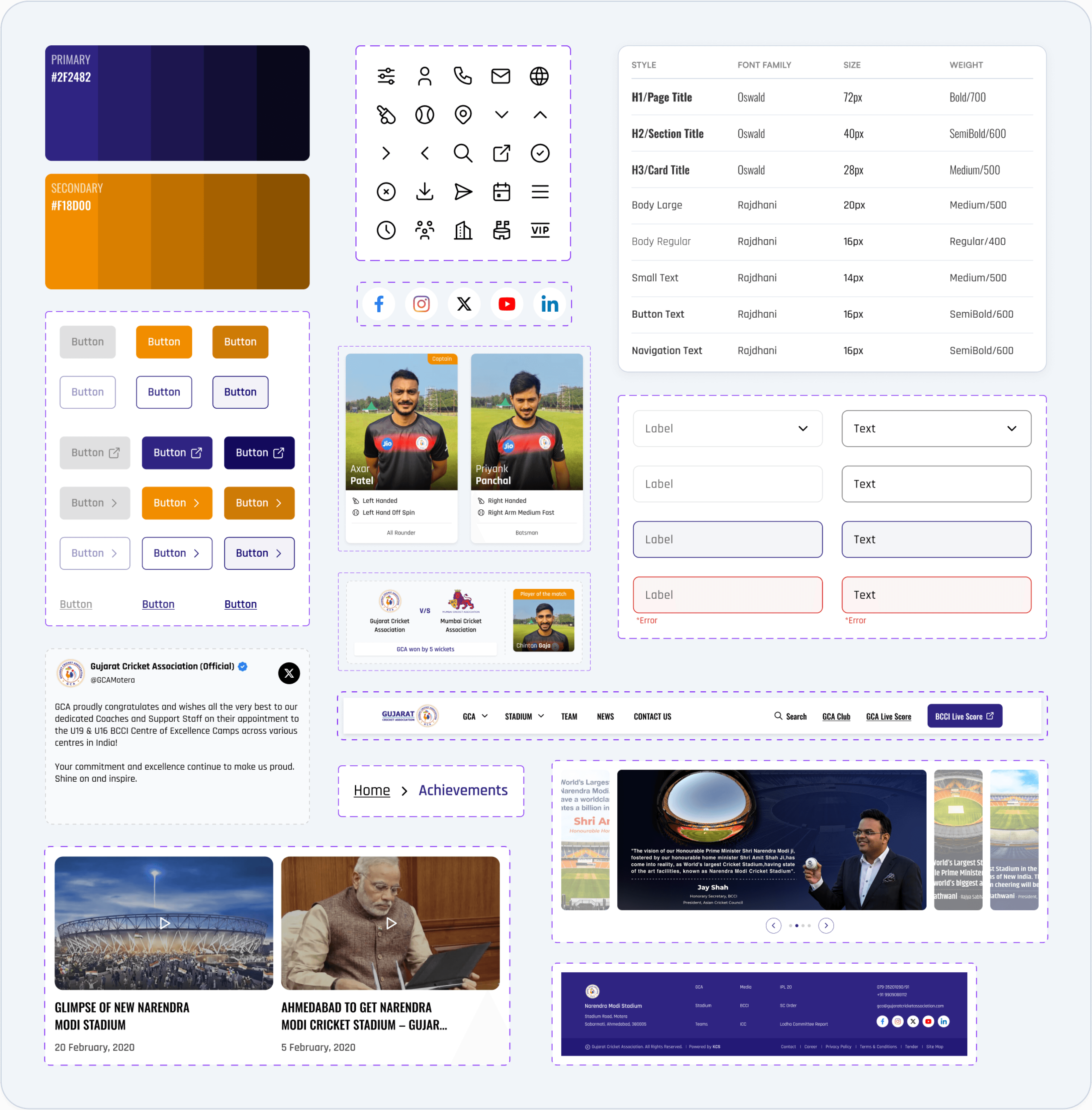
Before designing the final screens, I created a lightweight design system to keep the redesign consistent, scalable, and aligned with the cricket association’s identity.
Before designing the final screens, I created a lightweight design system to keep the redesign consistent, scalable, and aligned with the cricket association’s identity.
Hi-fi wireframes
Designing the New Experience
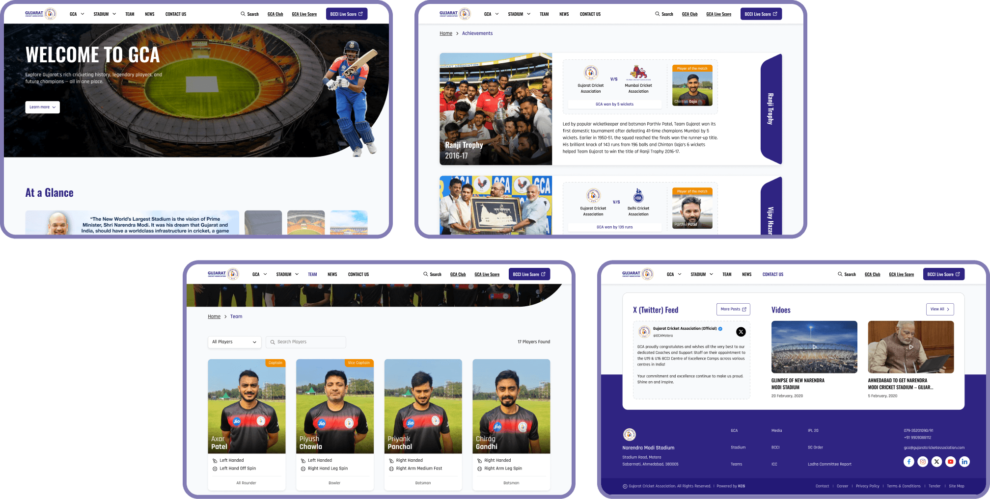
After defining the visual system, I created high-fidelity screens for the key areas where users experienced the most friction. The redesign focused on making the website feel more modern, structured, and easier to navigate while keeping the experience cricket-focused and professional.
Homepage Redesign
Before Issue: The homepage felt cluttered and did not clearly guide users toward important cricket content.
Design Decision: I redesigned the homepage with a stronger hero section, clearer content hierarchy, and modular sections that help users quickly discover stadium information, latest news, GCA highlights, videos, and social updates.

Achievements Page Redesign
Before Issue: Tournament achievements and scorecards were difficult to locate, scan, and understand.
Design Decision: I redesigned a dedicated Achievements page with large tournament cards, structured match details, final result summaries, and player-of-the-match highlights to make historical achievements easier to browse.

Team / Players Page Redesign
Before Issue: Users had to manually scan player information and could not easily find specific roles or player details.
Design Decision: I redesigned the team page with search, role filtering, player cards, role tags, and a visible player count to make player discovery faster and more efficient.

Contact Us Page Redesign
Before Issue: Contact details, map information, and inquiry options were not clear or direct enough.
Design Decision: I redesigned the Contact page with clear location cards, map access, organized contact details, and a visible inquiry form so users can quickly find support or reach GCA.

Hi-fi wireframes
Designing the New Experience
After defining the visual system, I created high-fidelity screens for the key areas where users experienced the most friction. The redesign focused on making the website feel more modern, structured, and easier to navigate while keeping the experience cricket-focused and professional.
Homepage Redesign
Before Issue: The homepage felt cluttered and did not clearly guide users toward important cricket content.
Design Decision: I redesigned the homepage with a stronger hero section, clearer content hierarchy, and modular sections that help users quickly discover stadium information, latest news, GCA highlights, videos, and social updates.
Stronger Hero Section
Users expected a cricket-themed and professional experience, so I redesigned the hero with strong stadium imagery, bold messaging, and a clear entry point.
Stadium feature cards
Research showed users wanted stadium-related information, so I converted long details into scannable feature cards with icons and numbers.
GCA Highlights
Important sections were not surfaced clearly, so I added dedicated cards for Hall of Fame, Star Attraction, Champions, and Teams.
Footer Grouping
Users needed quick access to important links, contact, and socials, so I redesigned the footer into clear grouped columns with visible contact information and social icons for easier navigation.
Latest News section
Users expected updates and cricket information, so I redesigned news into visual cards that are easier to browse.
Social + Video Feed
Users expected fresh cricket updates, so I added a combined social and video section above the footer to surface recent activity before users exit the page.
At a Glance carousel
Users needed faster access to key GCA updates, so I added a visual carousel to surface important information early.
Achievements Page Redesign
Before Issue: Tournament achievements and scorecards were difficult to locate, scan, and understand.
Design Decision: I redesigned a dedicated Achievements page with large tournament cards, structured match details, final result summaries, and player-of-the-match highlights to make historical achievements easier to browse.
Tournament Cards
Achievements were difficult to scan, so I organized each tournament into a consistent visual card layout.
Match Summary
Users needed quick match context, so I added team logos, opponent details, and final result in one compact area.
Player of the Match
Key player contributions were hard to notice, so I added a dedicated Player of the Match section inside each card.
Trophy Label
Tournament types needed clearer identification, so I added bold vertical trophy labels for quick recognition.
Team / Players Page Redesign
Before Issue: Users had to manually scan player information and could not easily find specific roles or player details.
Design Decision: I redesigned the team page with search, role filtering, player cards, role tags, and a visible player count to make player discovery faster and more efficient.
Search + Filter Controls
Users struggled to find specific players and roles, so I added search and role-based filtering at the top of the page.
Player Cards
Player details were hard to scan, so I grouped image, name, batting style, bowling style, and role into consistent cards.
Grid Layout
The team list needed better structure, so I used a clean card grid to make players easier to compare visually.
Player Count
Users needed clearer feedback while browsing, so I added a visible player count to show how many results are available.
Role Tags
Users had difficulty identifying roles like wicket keeper, so I added visible role labels such as Captain, Vice Captain, and Wicket Keeper.
Contact Us Page Redesign
Before Issue: Contact details, map information, and inquiry options were not clear or direct enough.
Design Decision: I redesigned the Contact page with clear location cards, map access, organized contact details, and a visible inquiry form so users can quickly find support or reach GCA.
Location Cards
Users struggled to find specific players and roles, so I added search and role-based filtering at the top of the page.
Contact Details Panel
Phone and email information needed better visibility, so I grouped all contact details into one scannable section.
Google Maps Access
Map information was difficult to find, so I added visible “View in Google Maps” actions for each location.
Contact Form
Users wanted an easier support pathway, so I added a contact form directly on the page.
Potential Impact
Potential Impact
Potential Impact
Faster player discovery:
Search, filters, role labels, and player cards can help users find specific players and roles with less manual scanning.
Faster player discovery:
Search, filters, role labels, and player cards can help users find specific players and roles with less manual scanning.
Clearer achievement browsing:
Dedicated achievement cards and match summaries can make tournament history easier to understand and compare.
Clearer achievement browsing:
Dedicated achievement cards and match summaries can make tournament history easier to understand and compare.
Improved contact access:
Location cards, Google Maps links, visible contact details, and a contact form can make it easier for users to reach GCA.
Improved contact access:
Location cards, Google Maps links, visible contact details, and a contact form can make it easier for users to reach GCA.
Stronger first impression:
A modern cricket-themed interface can improve the website’s credibility and make the experience feel more engaging.
Stronger first impression:
A modern cricket-themed interface can improve the website’s credibility and make the experience feel more engaging.
Better content scanning:
Modular sections, visual cards, and clearer hierarchy can help users quickly identify the information they need.
Better content scanning:
Modular sections, visual cards, and clearer hierarchy can help users quickly identify the information they need.
Key Learnings
Key Learnings
Key Learnings
Website redesign is not just visual improvement.
The biggest challenge was restructuring content so users could find information faster and with less confusion.
Website redesign is not just visual improvement.
The biggest challenge was restructuring content so users could find information faster and with less confusion.
Research helped prioritize design decisions.
Heuristic evaluation, surveys, personas, and usability testing helped identify which pages and issues needed the most attention.
Research helped prioritize design decisions.
Heuristic evaluation, surveys, personas, and usability testing helped identify which pages and issues needed the most attention.
Information-heavy websites need strong hierarchy.
Pages like Teams, Achievements, and Contact needed scannable layouts, clear labels, and repeated patterns to reduce cognitive load.
Information-heavy websites need strong hierarchy.
Pages like Teams, Achievements, and Contact needed scannable layouts, clear labels, and repeated patterns to reduce cognitive load.
Small interaction patterns can solve major usability issues.
Features like filters, search, role tags, map links, and contact forms directly addressed user pain points.
Small interaction patterns can solve major usability issues.
Features like filters, search, role tags, map links, and contact forms directly addressed user pain points.
The next step would be validation.
If continued, I would test the high-fidelity prototype with users and compare task success, completion time, and user confidence against the original website.
The next step would be validation.
If continued, I would test the high-fidelity prototype with users and compare task success, completion time, and user confidence against the original website.